ID Photo Standards for IDs: A Simple Guide for Consistency
Why Consistent ID Photos Matter Across a Team
When everyone’s badge photo looks like it belongs to the same system—similar lighting, similar crop, similar background—identification becomes faster and more reliable. Strong ID photo standards aren’t about making people look identical; they’re about removing avoidable differences (like harsh shadows or distracting backgrounds) that make quick recognition harder.
In day-to-day work, a clear photo supports simple moments: greeting a new coworker by name, verifying access at a controlled door, or matching a face to a directory entry. In larger organizations or multi-site teams, consistent employee photos also reduce confusion when people travel between locations or when managers and security staff don’t know every employee personally.
A consistent photo style helps badges do their job: quick recognition, fewer double-takes, and a more unified, professional look across the organization.
- Recognition at a glance: similar framing and lighting make faces easier to scan quickly
- Fewer retakes and delays: a shared checklist reduces “almost usable” photos
- Cleaner printed badges and directories: standardized photos fit layouts predictably
- Smoother security checks and visitor management: less ambiguity when confirming identity
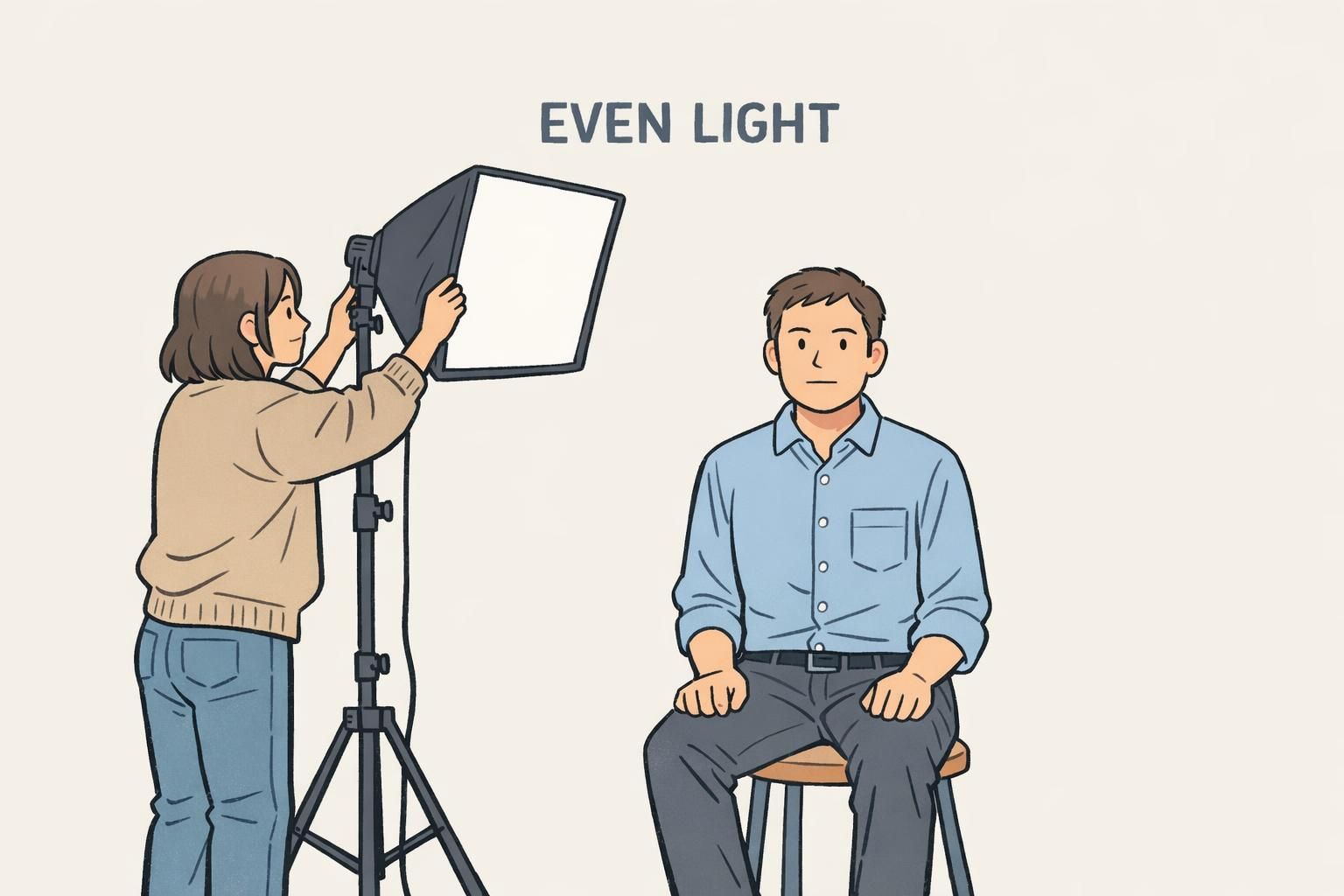
Lighting Guidelines: Even, Neutral, and Shadow-Free
Lighting is the difference between a photo that looks clear on a badge and one that looks harsh, washed out, or hard to read at a distance. The goal is soft, even light that shows the full face clearly—without deep shadows under the eyes, nose, or chin.
If you’re taking photos in an office, avoid strong backlighting from windows. When the brightest light is behind the subject, the camera often darkens the face. Also be cautious with direct flash: it can create shiny “hot spots” on skin and glare on glasses, both of which reduce clarity once the image is printed small.
- Use soft, even lighting from the front (or two lights at slight angles) to reduce shadows
- Keep lighting neutral—avoid colored bulbs that tint skin tones
- Avoid standing right against a wall, which can create strong background shadows
- If glasses glare is an issue, slightly raise the light or have the subject tilt glasses down a touch (while keeping eyes visible)
No. A consistent spot with neutral indoor lighting or indirect daylight can work well. What matters most is repeating the same setup so every photo matches the same standard.
Not always, but direct on-camera flash often creates glare and harsh shadows. If flash is used, it should be diffused and consistent across the whole team.
Background Standards: Clean, Light, and Distraction-Free
A busy background competes with the face—especially on a printed ID badge where the photo may be small. A plain, light-colored background (white, off-white, or light gray) helps facial features stand out clearly and keeps your badge layout looking organized.
Background consistency is also one of the fastest ways to create consistent employee photos across different departments. If everyone uses the same wall (or the same portable backdrop), you’ll instantly remove many of the “this looks like it came from a different office” differences.
- Choose a plain wall or backdrop: white, off-white, or light gray
- Remove visual clutter: posters, shelves, plants, and open doors
- Keep the subject slightly away from the wall to reduce shadow outlines
- Avoid patterns or textured walls that show up strongly in print
If your team can only standardize one thing quickly, standardize the background. A clean, light background makes photo sets look cohesive even when taken in different offices.
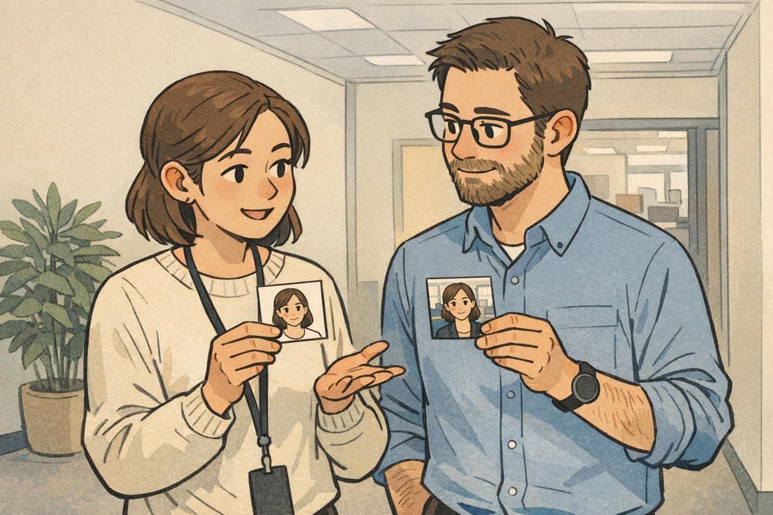
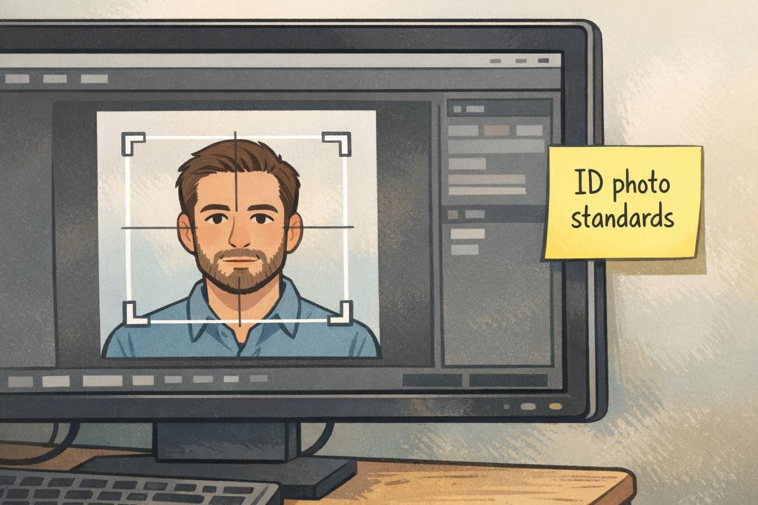
Framing & Pose: Head Position, Eye Line, and Cropping Consistency
Consistent framing makes badges look uniform and helps people recognize faces faster. Use a straight-on, frontal pose: head level, shoulders squared, eyes open, looking directly at the camera. This reduces distortion and keeps key features (eyes, nose, mouth) aligned similarly from badge to badge.
For cropping, aim for a predictable head-and-shoulders photo where the face is centered and similarly sized each time. A practical benchmark is the head occupying roughly 70–80% of the frame, with a little room above the hair and enough shoulder visible to avoid a “floating head” look. Keeping camera height near eye level helps avoid extreme angles that change how someone looks.
These same themes—frontal pose, controlled lighting, and consistent face size—are common in widely used ID photo guidance and biometric-quality checks because they improve repeatability and reduce avoidable variation in images (source). The takeaway for an everyday badge program is simple: standardization makes photos easier to compare and easier to trust.
- Camera at eye level: reduces “looking up” or “looking down” distortion
- Straight-on angle: no tilted head or dramatic turn
- Consistent crop: head-and-shoulders, face centered
- Consistent face size: keep the head similarly scaled across the team
“The fastest way to make a badge wall or employee directory look professional is to keep the camera height, crop, and background the same for everyone—even if photos are taken on different days.” – Operations Coordinator
Expression & Appearance: Natural, Recognizable, and Policy-Friendly
A badge photo is primarily for recognition, so the best expression is one that looks like the person on a normal day. A neutral expression—mouth closed, eyes visible—tends to work well because it avoids extremes that can make photos look inconsistent across the team.
Accessories and grooming choices should be handled with a light touch: the goal is to avoid anything that obscures the face. Sunglasses, for example, hide the eyes and make recognition harder. For hair, the simplest guideline is to keep eyes visible when possible.
If your workplace has attire expectations, define a simple rule set that people can follow without stress. Many teams choose “everyday work clothing” and ask employees to avoid highly distracting patterns—less because patterns are “wrong,” and more because they draw attention away from the face and can look inconsistent when printed on badges.
- Use a natural, neutral expression for easy recognition
- Keep eyes visible; avoid sunglasses
- Minimize accessories that cover the face
- Use simple attire guidance that can be applied consistently across roles
Not necessary. Consistency comes more from lighting, background, and framing. If you give attire guidance, keep it simple and focused on avoiding distracting patterns.
A modest, natural look can be fine as long as the organization applies the same expectation consistently and the photo remains recognizable.
Digital File Specs: Resolution, Format, and “No Filters” Rules
Even a well-shot portrait can fail if the uploaded file is low quality or heavily edited. Set a clear baseline: the face should be in sharp focus, colors should look natural, and the image should not use filters or heavy retouching that changes identifying features. This keeps photos consistent and avoids surprises when images are printed on badges or displayed in access control systems.
File standards also reduce rework. When people know exactly what’s acceptable—format, orientation, and naming—your team spends less time chasing replacements and more time issuing badges on schedule.
- Focus: face must be sharp (avoid motion blur and soft focus)
- Color: natural tones; no filters
- Format: standardize on JPEG for simple compatibility
- Orientation: keep images upright (no sideways uploads)
- Naming: use a consistent pattern such as Lastname_Firstname
Think of file specs as the “handoff standard.” Good capture habits plus clear upload rules are what keep badge photo tips consistent across teams and locations.
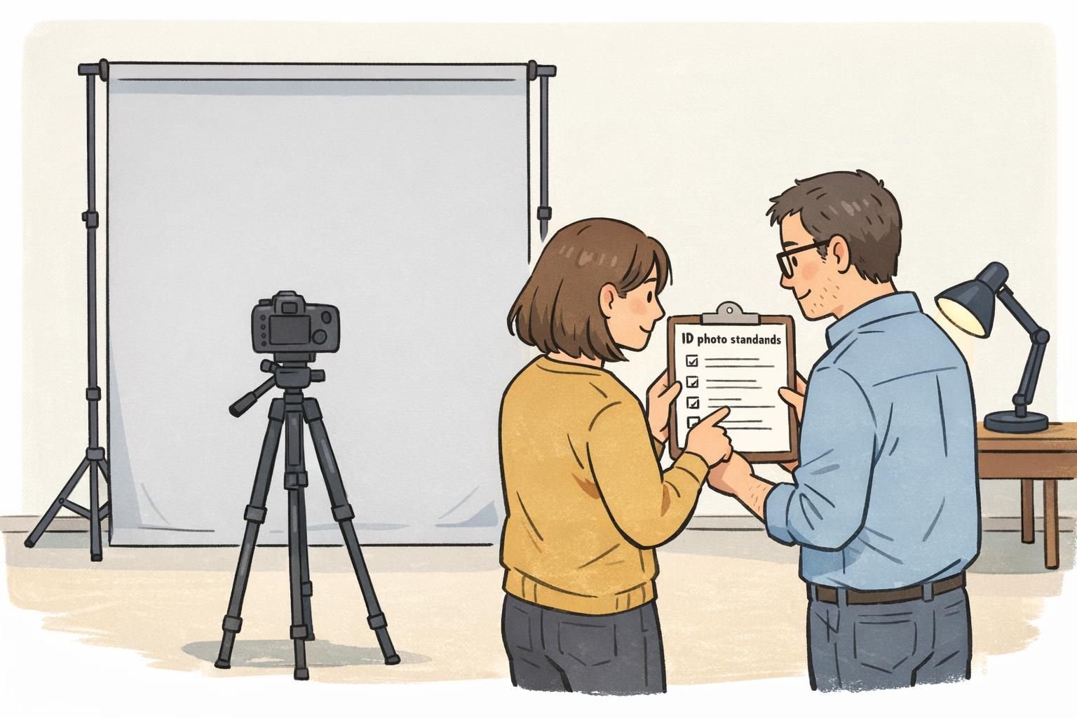
A Simple Workflow: Capture, Review, Approve, and Reuse
A repeatable workflow is what turns good intentions into consistent results. The easiest approach is to create one photo spot (or one portable kit), document the setup, and follow the same steps every time. This matters even more when multiple offices or admins take photos, because small differences add up quickly.
Build in a quick review before a photo is accepted. A 15-second check can catch the most common issues—shadows, busy background, off-center crop—before the image becomes “official” and ends up on a printed badge, directory, or access system.
- Capture: use the same background location and lighting setup
- Check: confirm the face is centered, well lit, and in focus
- Approve: store the chosen photo as the official version
- Reuse: keep an approved photo library for reprints, replacements, and onboarding
“Our checklist is simple: clean background, even light, eyes visible, and a consistent crop. The review step saves us from reprints later.” – HR Generalist
Common Mistakes That Make Badges Look Unprofessional (and How to Fix Them)
Most badge photo problems come from a handful of repeatable issues. The good news is that the fixes are usually quick—often a small adjustment in position, lighting, or camera height makes the difference.
- Uneven lighting and harsh shadows: move the subject slightly, add a softer front light, or use indirect daylight
- Backlit faces from windows: rotate the setup so light comes from in front, not behind
- Busy backgrounds: switch to a plain wall or hang a light backdrop
- Off-center faces or inconsistent crop: mark a standing/sitting spot and use the same camera distance each time
- Extreme angles: keep the camera at eye level and ask for a straight-on pose
- Overexposed or blurry images: steady the camera, increase light, and retake before cropping too tightly
If a photo looks “fine” on a phone but questionable when zoomed out, it will likely look worse when reduced to badge size. A quick retake is often faster than trying to rescue the image later.
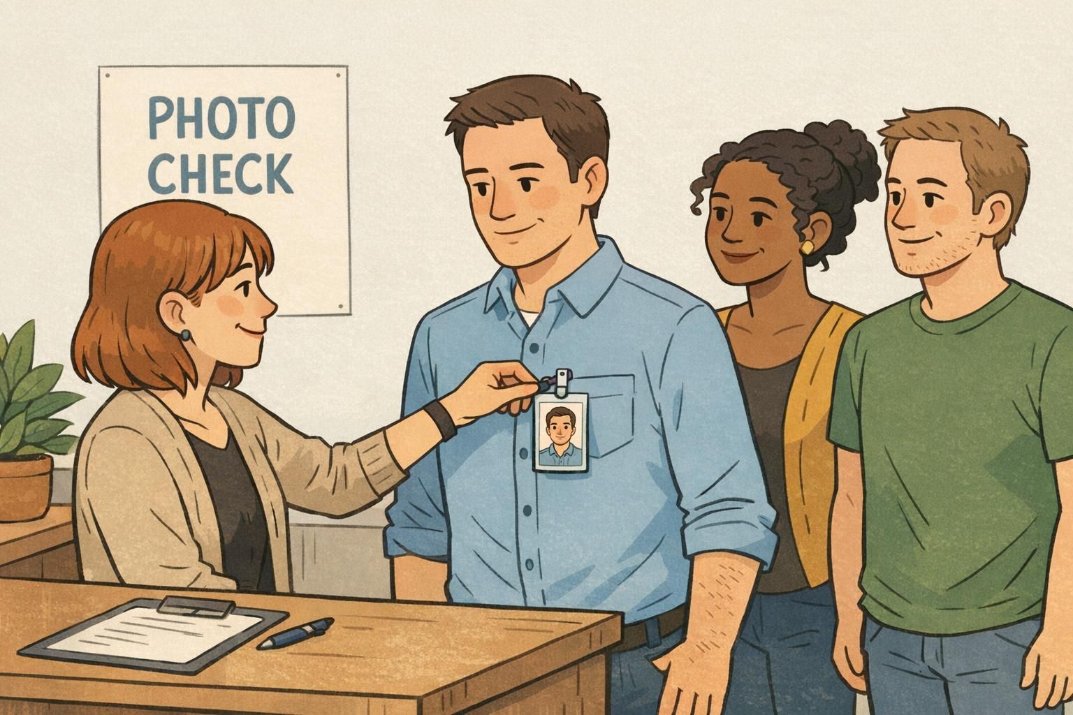
Putting Standards Into Practice on Printed ID Badges and Event Credentials
Once you’ve defined standards, the next step is making sure the final badge or credential reflects them. Photos can look different depending on layout, crop windows, and printing size. Decide in advance how the image will be used—vertical vs. horizontal, how much shoulder is shown, and whether the system auto-crops—so the printed result matches your intent instead of relying on a guess.
This is especially important for event badges and workplace IDs that need quick verification. When every photo follows the same rules, the set looks cohesive and is easier to scan at a glance—whether badges are worn on lanyards, clips, or holders.
If your team is updating an ID program, or you’re expanding across sites, BadgeZoo can produce custom photo ID badges designed to display consistent employee photos clearly and reliably.
- Confirm badge layout and photo window size before collecting photos
- Use one set of crop rules so faces appear consistently sized on every badge
- Preview a small proof set to catch issues early (lighting, background, or cropping)
- Apply the same photo rules to event credentials so staff and attendees look cohesive