Badge Design Mistakes Organizations Keep Making (And How to Fix Them)
Why Badge Systems Drift Over Time
Most organizations don’t set out to create confusing ID badges. The problems show up slowly—after months or years of new hires, site expansions, vendor changes, evolving security needs, and last-minute event requests. Templates get tweaked “just this once.” A department makes an exception. A new color gets added. Before long, you’re dealing with badge design mistakes that create daily friction for staff, reception, and security. The good news: you usually don’t need to rebuild your entire badge program. You can tighten what you already have by focusing on clarity, consistency, and maintainability. This article breaks down common, avoidable issues that mature programs accumulate—across ID cards, name tags, event badges, badge buddies, and other role identifiers—and gives practical ways to prevent and fix them.
- Think of improvements as “reprint cycle upgrades,” not a big-bang redesign
- Optimize for real-life use: movement, distance, lighting, and fast decisions
- Standardize what matters most, and keep the rest flexible behind the scenes
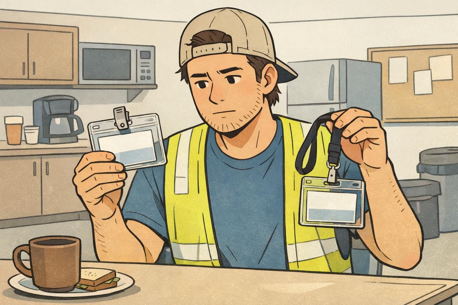
Mistake #1: Designing for “Looks” Instead of Fast, Accurate Identification
One of the most common badge errors in a mature program is a slow drift toward aesthetics over function. Over time, designs pick up extra visual elements: larger background images, decorative patterns, more brand colors, and smaller text. The badge may look polished up close, but it becomes hard to read in motion or from a few steps away—exactly how badges are usually viewed. The fix is to treat the badge like a tool. Its primary job is fast, accurate identification by humans. Brand matters, but it should support clarity—not compete with it.
If someone can’t quickly confirm “who is this?” and “what’s their role/access?” at a glance, the badge is underperforming—no matter how good it looks in a mockup.
- Build a simple information hierarchy: Name → Role/Access → Organization
- Use large, high-contrast name text (especially for reception and floor leads)
- Avoid busy backgrounds behind critical text; reserve patterns for borders or back-of-badge
- Test in realistic conditions: 6 feet away, under indoor lighting, while walking past someone
- Check uniform and lanyard color conflicts so the badge doesn’t visually disappear

Mistake #2: Inconsistent Rules Across Departments, Sites, or Events
In a growing organization, inconsistency is rarely intentional. It’s usually the result of helpful people solving local problems: a clinic adds a role label, a warehouse changes colors, an event team makes a new format for sponsors, or a satellite office uses a different printer and slightly different sizing. The result is predictable: verification slows down. Staff must “relearn” what badges mean depending on location or event. And when security or reception is busy, inconsistency increases errors—because people rely on quick pattern recognition. This is where documented standards matter. When programs have clear criteria and processes that remain understandable over time—even to people who weren’t there at launch—they’re easier to maintain and less likely to drift. That principle is widely recognized in operational systems that require shared understanding and governance (source).
- Create a simple “badge spec” document (one page is fine) that defines size, layout, type scale, and color meaning
- Set rules for photos: placement, background expectations, and what’s allowed/not allowed
- Define expiration handling: where the date goes (or how it’s encoded) and how it’s verified
- Audit current badges and bring outliers into compliance during renewals and reprints
- Train front-line verifiers on one standard format, instead of local variations
“We didn’t realize how much time we were losing until we standardized the layout across sites. Once everyone used the same rules, check-in and floor verification got noticeably faster.” – Operations Coordinator
Mistake #3: Overloading the Badge With Too Much Information
As organizations mature, badge requests accumulate. A team asks for pronouns. Another wants job title and department. Another wants location, shift, supervisor, certifications, and training status. Each addition feels reasonable—until the front of the badge becomes a dense cluster of fields that no one can scan quickly. This is a classic case where “more information” reduces usable information. When people have to search the badge for what they need, they make mistakes or stop trying. In practice, the badge becomes decorative instead of functional. A reliable badge best practices approach is to keep the front focused on what humans need in the moment, and move everything else to systems designed for detail.
- Keep the front to the essentials: name, photo (when used), role/access cue, and organization
- Move secondary details to the back of the badge when they’re occasionally needed
- Use a barcode/QR for internal lookups so staff can retrieve details without printing them all
- If you need quick visual differentiation, use a single color band or a small icon set with clear meaning
- Prefer replaceable overlays (like badge buddies) for frequently changing roles rather than reprinting the primary badge
A badge isn’t a résumé. It’s a fast decision aid: clear, minimal, and consistent.
Mistake #4: Weak Photo Standards and Unreliable Headshots
Photo-based identification often degrades over time. Early on, a program may launch with clean headshots. Later, photos get sourced from whatever is available: selfies, cropped group shots, old images, mixed backgrounds, harsh shadows, hats, sunglasses, heavy filters, or extreme angles. When photo standards aren’t consistent, the badge stops supporting recognition. That impacts not only security, but everyday service and teamwork—especially in environments with visitors, rotating staff, or multiple shifts. Strong photo standards don’t have to be complicated. They just need to be explicit and repeatable.
- Use simple guidelines: neutral background, face centered, good lighting, no heavy filters
- Set a refresh cadence for long-term staff or volunteers so photos don’t become outdated
- Provide a quick capture option during onboarding or event check-in to reduce back-and-forth
- Reject photos that reduce recognition (extreme angles, deep shadows, obscured face)
Not always. If your environment relies on quick face recognition or has higher security needs, photos can help. If photos are used, consistency matters more than perfection.
Inconsistency—mixed lighting, backgrounds, and outdated images that make badges harder to verify quickly.
Mistake #5: Color Coding Without Governance (or With Too Many Colors)
Color coding starts as a smart shortcut: staff vs. visitor, contractor vs. employee, VIP vs. general attendee. Then reality hits. New categories appear. Temporary roles get added. Someone wants a special color “just for this one event.” Over time, the system turns into a rainbow that only a few people understand. This is one of those common badge errors that feels minor until it’s costly: staff hesitate, ask questions, or miss cues entirely. Color coding only works when the meaning is limited, documented, and consistently applied.

- Limit your palette to a small set and publish what each color means
- Avoid “special one-off” colors unless there’s a policy and an owner for it
- Test for accessibility: color-vision deficiencies and low indoor lighting conditions
- Don’t make meaning color-only—pair colors with a clear role label or icon
- For frequently changing roles, use badge buddies or overlays rather than reprinting primary badges
If someone needs a legend to interpret your colors, the system has already become too complex for fast verification.
Mistake #6: Not Planning for Change: Reprints, Expirations, and Role Updates
Many badge programs are built around issuance—then struggle with everything that happens after. Name changes, lost badges, cracked cards, role updates, temporary assignments, and expiring credentials are normal. If you don’t define a clean process, exceptions become the process. The operational cost shows up in small ways: reception improvises, supervisors get pulled into ad-hoc approvals, old badges remain active too long, and people wear outdated roles because updating the badge is a hassle. A mature program stays healthy when change is expected and handled consistently.
- Define service-level expectations: how fast a reprint happens and who handles it
- Set approval rules for role/access changes so updates are controlled and auditable
- Establish a process to collect, deactivate, or invalidate old badges when replaced
- Build a quarterly or annual template review so standards evolve without drifting
- Use expiration cues consistently so staff know what “current” looks like

Mistake #7: Choosing the Wrong Materials or Attachment for the Environment
Wear-and-tear problems usually don’t show up in the first week. They appear after repeated daily use: clips that slip off uniforms, lanyards that break, print that rubs off, cards that crack, and holders that fail in high-motion settings. These are badge design mistakes too—because the badge system includes the physical reality of how it’s worn. If the badge falls off, flips backward, or becomes unreadable, the identification system fails even if the template is perfect. The fix is to match the configuration to the environment and standardize a small set of options so replacements stay consistent.
- Use durable card stock and protective holders for active roles and high-contact settings
- Match attachment style to clothing: clips for uniforms and pockets, lanyards for office wear, other options when snag risk is high
- Choose vertical vs. horizontal orientation based on how badges hang and how often they’re scanned
- Standardize a few approved configurations so ordering and replacements are simple
- Test a small pilot group for a week before switching an entire site
Mistake #8: Treating Accessibility as an Afterthought
Accessibility issues often go unnoticed at launch, then become obvious in everyday use: staff squinting at small text, low-contrast layouts becoming unreadable under certain lighting, or role cues that depend entirely on color. The goal isn’t to make badges “perfect.” It’s to make them reliably readable and interpretable by as many people as possible, in the environments where they’re actually used. This is one of the badge best practices that improves both experience and safety, without requiring a total redesign.
- Increase font sizes for names and roles; avoid thin or overly stylized typefaces
- Use high-contrast combinations that hold up under indoor and mixed lighting
- Don’t rely on color alone—pair with a clear role label or redundant visual cue
- Simplify layouts so the eye knows exactly where to look first
- Phase improvements in during normal reprint cycles to minimize disruption
“The biggest improvement we made wasn’t adding features—it was making names and roles readable for everyone, in every hallway and lobby.” – Facilities Manager
A Practical Badge Audit Checklist (Fix What You Have, Not What You Wish You Had)
If your badge system has been running for a while, the fastest way forward is a short audit. Treat it like preventive maintenance: you’re looking for small drifts that create confusion, not trying to redesign your entire identity program. Run the checklist below with a handful of real badges from different departments, sites, and event types. Aim for the changes that remove daily friction first—then standardize deeper over time. If you decide to update templates or standardize supplies, BadgeZoo’s customizable ID badges can support consistent reprints and role-based identification without forcing you to reinvent your process.
- Readability at 6 feet: Can you confirm name and role quickly without squinting?
- Hierarchy check: Is the most important information (Name → Role/Access → Organization) visually obvious?
- Consistency: Do departments/sites/events follow the same layout rules and meanings?
- Role clarity: Are role cues understandable without insider knowledge?
- Photo quality: Are photos recent, consistent, and usable for recognition?
- Color governance: Is the palette limited, documented, and not color-only?
- Durability: Are cards, holders, and attachments surviving the real environment?
- Reprint workflow: Is there a clear process for lost badges, updates, and collection/deactivation of old badges?
- Accessibility: Are text size and contrast reliable in varied lighting for a wide range of users?
Most badge design mistakes aren’t “design problems” alone—they’re process problems. The strongest systems make it easy to do the right thing every time, especially during reprints and changes.