Badge Information: What Belongs on the Front to Avoid Clutter
Why Badge Information on the Front Matters
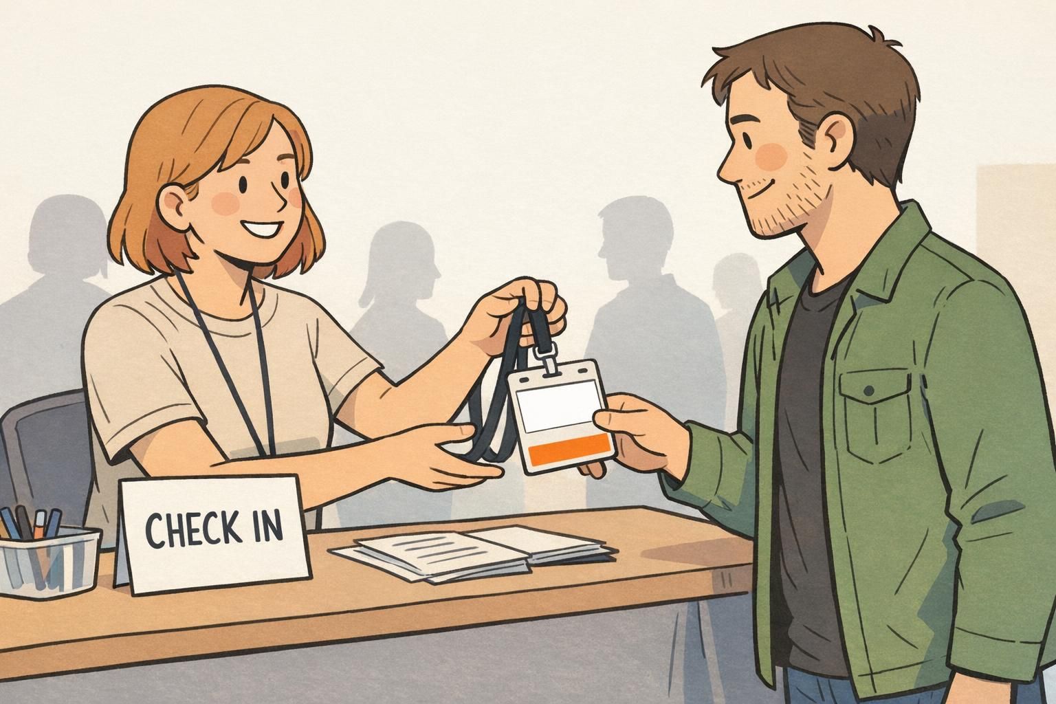
In most workplaces and events, the front of an ID is used for one job: fast, comfortable recognition while standing a few feet apart. When badge information is easy to scan, people can greet each other correctly, teams move faster, and security checks feel routine instead of awkward.
The problem is that the front of a badge is a small canvas, but it often gets asked to do too much—credentials, job titles, numbers, policies, icons, multiple logos, and scanning elements. As the front gets crowded, the most human-friendly items (who someone is, what they look like, and why they’re there) become harder to find quickly. That’s when you get the “Sorry—what was your name again?” moments that a badge is supposed to prevent.
A clean front is not about removing important information—it’s about putting the right information where people naturally look first.
- Recognition: Helps others identify you quickly without staring or stepping too close.
- Security: Makes visual checks easier for staff and guards during normal movement.
- Confidence: Reduces awkward introductions and role confusion in busy spaces.
- Consistency: Creates a standard look across departments and event types.
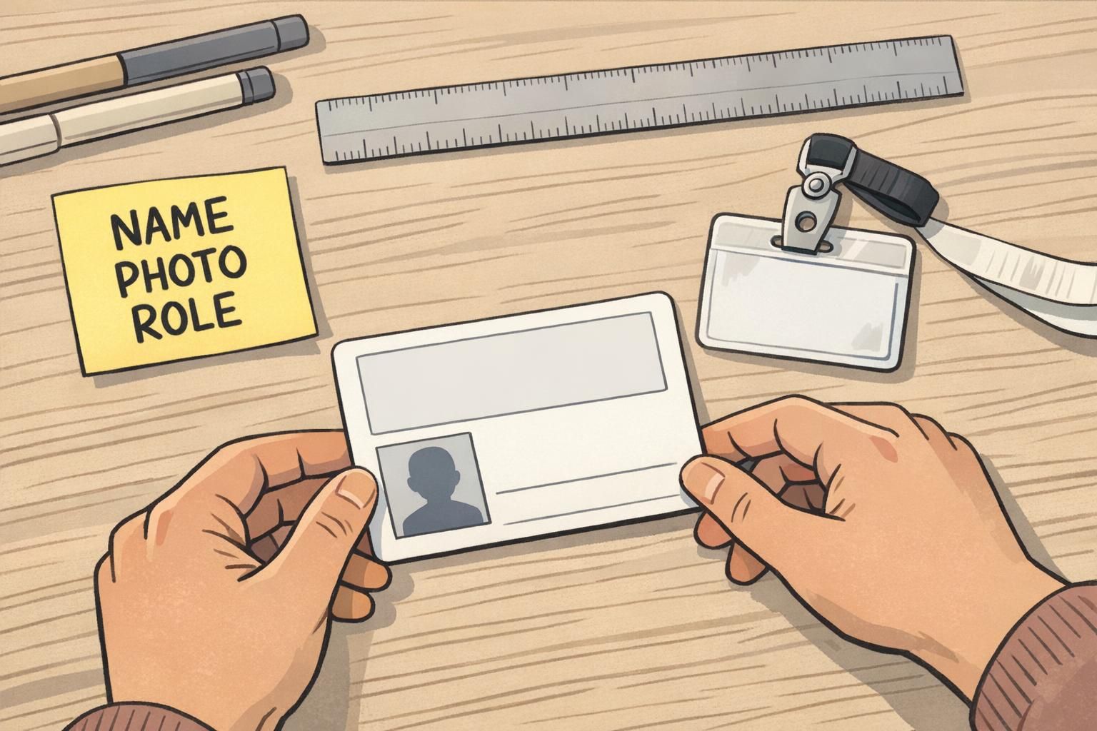
The 3 Front-Side Priorities: Name, Photo, Role
If you want a front that works in real life, prioritize a simple hierarchy. For most organizations, the highest-value order is: a large, readable name; a clear photo; and a short role or department line. These three elements cover the majority of everyday interactions—meeting someone, confirming identity, and understanding context.
The name should be the most prominent text on the badge. The photo should be big enough to recognize at a glance, not a tiny headshot squeezed between other elements. The role/department should be short and scannable (think “RN,” “Facilities,” “Visitor,” “IT,” “Volunteer”), not a long title that wraps into multiple lines.
This is also where an uncluttered ID card helps with accessibility. People read badges under bright lights, while walking, and sometimes at angles through a holder. A strong name-photo-role layout stays effective even when conditions aren’t perfect.
“If I can’t find the name in one second, the badge isn’t doing its job.” – Operations Coordinator
Usually no. If role is the primary need (for example, in a clinical setting), keep it highly visible—but still avoid shrinking the name so much that greetings become difficult.
If photos aren’t used, consider strengthening other “at-a-glance” cues (like a clear role label or a single status band). Just avoid replacing the photo with lots of small text.
A Compact, Recommended Front Layout (Fits Most Workplaces)
A practical front layout is less about decoration and more about predictable placement. When people know where to look, they can scan faster. A simple grid-based layout works across offices, schools, healthcare, and events.
- Top-left: Small organization logo (keep it modest so it doesn’t compete with the face or name).
- Top-right (optional): A simple ID type label like “STAFF” or “VISITOR” if you truly need it on the front.
- Center: Photo with clean edges and enough size to be recognizable.
- Bottom: Name in bold, largest text on the card.
- Under the name: Role/department in a smaller line (short, non-wrapping).
To keep it a readable badge, use high contrast (dark text on a light background or vice versa), limit your font choices, and protect whitespace around the name and photo. One font family with one or two weights is typically enough.
If you need a barcode or QR code for access control or check-in, consider placing it on the back. If it must be on the front, keep it along a bottom edge only if it doesn’t compete with the name line. The front should still read as “person first, details second.”
A good quick test: shrink your design on screen until it’s about the size of a real badge viewed from arm’s length. If the name and face aren’t instantly obvious, simplify.
What to Move Off the Front (And Where It Can Go Instead)
Many organizations put extra items on the front because they’re important—but importance doesn’t always mean “front-facing.” If the goal of the front is instant recognition, then anything that slows recognition should usually move elsewhere.
Details that commonly create clutter include full job titles, long credential strings, multiple logos, policy text, emergency instructions, and dense ID numbers. These items often fit better on the back of the card or in a secure directory, where they can exist without competing with the name and photo.
This “front for scanning, back for details” approach aligns with the broader idea that primary displays should stay minimal so people aren’t overloaded while trying to complete a quick task. When deeper criteria or added information is needed, it can be placed somewhere secondary rather than crowding the primary view (source).
- Move to the back: Long titles, credential lists, employee/visitor numbers, expiration dates (when allowed), emergency instructions, and policy statements.
- Use secure systems: Detailed permissions, training/compliance status, and full identity records.
- Back for access control: Barcodes, magnetic stripes, and other machine-readable elements when possible.
If you need it for quick checks, it can be on the front, but it’s often better on the back so the main face remains clean. The front should still prioritize name and photo.
Try to use one logo on the front. Additional logos can go on the back or in event materials, so the badge face stays focused.

Design Rules That Keep a Readable Badge in Real Life
Badges are read while people are moving, turning, or standing under mixed lighting. A design that looks fine on a large screen can become hard to scan once it’s printed, inside a holder, and hanging from a lanyard. These practical rules keep the front readable in everyday use.
- Make the name the largest text: If you do only one thing, do this.
- Protect contrast: Avoid low-contrast color combinations and busy patterns behind the name or photo.
- Use whitespace on purpose: Space around the name and photo improves speed of recognition.
- Limit font variety: One font family with one or two weights reduces visual noise.
- Avoid patterned backgrounds: If you want branding, keep it subtle and away from key information.
- Use a single status marker: If needed, choose one clear band or icon instead of multiple callouts.
Also consider the physical realities: badge holders and clips can cover edges. Keep critical content away from the top slot area, corners, and tight margins. If you’re printing a vertical layout, remember that some lanyards twist—so front-side hierarchy should still work when the badge swings.
If two elements “fight” for attention on the front, the badge is telling the reader to do extra work. Simplify until the eye naturally lands on the face, then the name.
Role-Based Variations: Healthcare, Schools, Corporate, Events
Different environments have different pressures, but the best results usually come from the same principle: keep the same core front-side priorities, then add only one context-specific element. This maintains a consistent look across teams while still respecting local needs.
- Healthcare: Role clarity can be essential (for example, RN, MD, Tech). Keep the role highly visible, but still keep the name and photo dominant.
- Schools: Visitor vs. staff status may be the key “extra” item. Use a simple label or color band rather than extra lines of text.
- Corporate: Department can be useful, but keep it short and avoid multi-line titles that push the name smaller.
- Events: Attendee type (Speaker, Exhibitor, Staff) often matters more than department. Prioritize category recognition without adding extra dense details.
If you find yourself adding a second or third “must-have” item, pause and ask: does this help someone identify the person quickly, or is it information that can be checked elsewhere? That question alone prevents most front-side clutter.
When Extra Info Is Required: Use Badge Buddies and Smart Add-Ons
Sometimes you genuinely need prominent status information—like “VISITOR,” “CONTRACTOR,” or “VENDOR”—and you need it visible from farther away than someone’s name. The mistake is trying to solve that by shrinking the name and photo to make room for more front-side text.
A badge buddy is a simple way to keep the ID card clean while adding high-visibility status. The buddy sits behind the ID and can display one big, standardized label or color cue. This keeps the front design consistent while still supporting quick access-level recognition for facilities, hospitals, and events.
- Use a buddy for: Access level, visitor/contractor status, and quick category recognition.
- Keep the ID card for: Name, photo, and role (the person-specific essentials).
- Standardize across teams: One buddy style per status avoids confusion and reduces redesigns.

Products That Support Clean Layouts (Without Sacrificing Clarity)
The physical format you choose can make it easier to keep the front simple. Orientation, holder choice, and add-ons all affect what stays visible and what gets covered or distorted during daily wear.
For many workplaces, durable PVC ID cards and a clear holder help maintain consistent alignment and visibility. If you’re trying to reduce front-side clutter, it can also help to pair a clean ID with a bold backing solution (like a buddy) instead of adding more lines of text to the card face.
If your organization wants a standardized way to show access levels without redesigning every card layout, you can use a dedicated backing option like custom badge buddies to highlight status while keeping the ID itself focused on the essentials.
The goal isn’t to remove information—it’s to choose the right “surface” for it: front for instant recognition, back for details, and add-ons for high-visibility status.
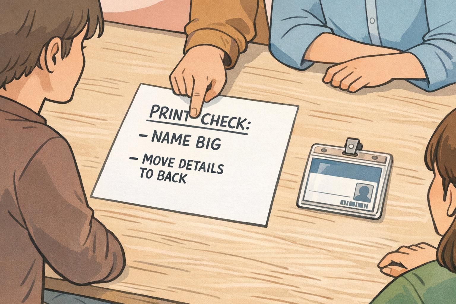
A Quick Checklist Before You Print
Before you print a batch of badges, do a quick reality check. Most clutter problems are easy to fix at the proof stage and frustrating to fix after printing.
- Name is the largest text on the front.
- Photo is clear and large enough for quick recognition.
- Role/department is short and doesn’t wrap.
- Contrast is strong (especially behind the name and photo).
- Whitespace exists—elements don’t touch or visually collide.
- Nothing critical is too close to edges where holders or clips can cover it.
- Any barcode/QR is placed so it doesn’t compete with the name (ideally on the back).
- Preview at real size (or print a test) and check readability at arm’s length.
If anything competes with the name, that’s your signal to move it. Put detailed items on the back, store deeper criteria elsewhere, or use a buddy for status. That’s how you keep badge information useful without overloading the front.