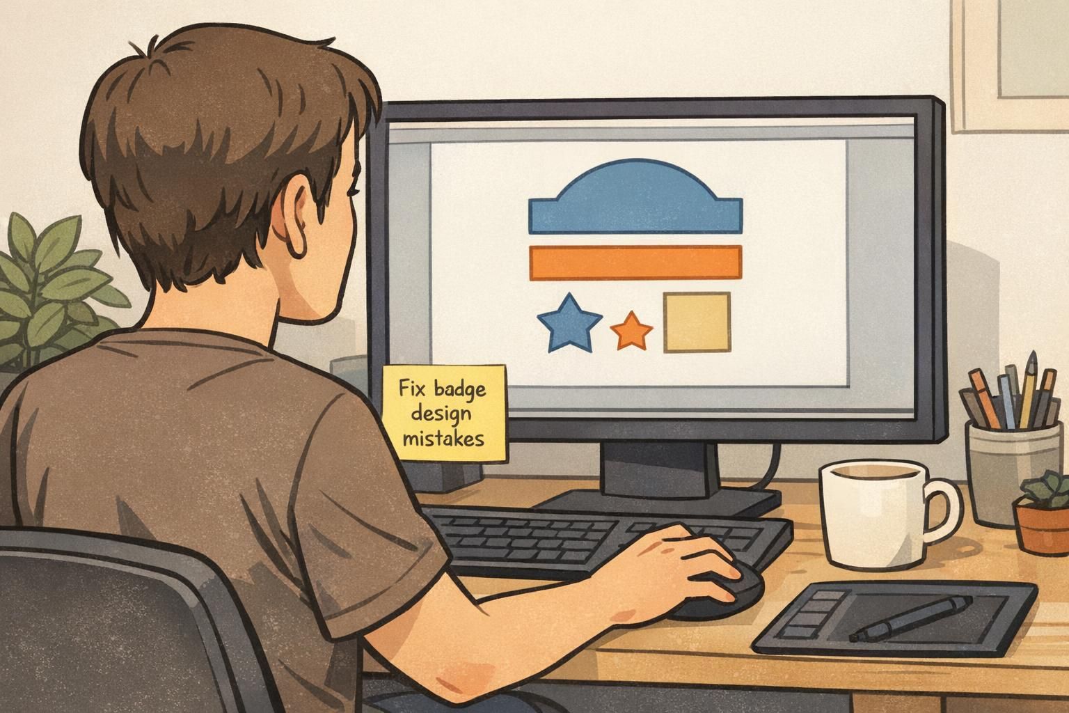
Badge Design Mistakes: Common Issues and How to Avoid Them
Why badge design mistakes happen (and why they’re fixable)
Most badge design mistakes don’t come from careless teams—they come from “temporary” decisions that quietly become permanent. Someone needed a quick badge for a new hire. An event template got reused for visitors. A logo update forced a layout tweak. Over time, small compromises stack up, and suddenly badges are harder to read, inconsistent across departments, or frustrating to wear every day.
The good news: the most common badge design mistakes are fixable without starting over. You can keep your brand style and your existing tools while tightening a few rules—like type hierarchy, contrast, photo cropping, and safe margins for clips and holders. This article walks through common badge errors with simple before/after guidance so you can improve readability, consistency, and real-world usability.
A badge is a tiny interface for real people. If it’s hard to scan in a hallway, at a check-in desk, or on a busy floor, the design isn’t doing its job—even if it looks great on screen.

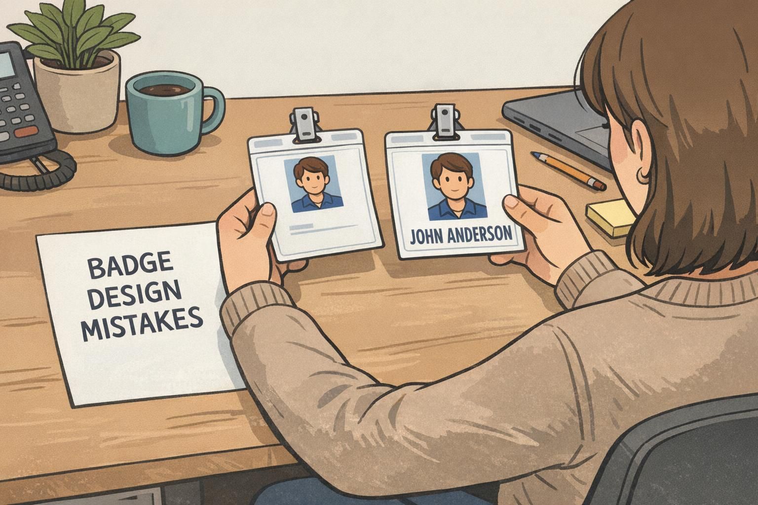
Mistake #1: Prioritizing branding over readability
One of the most common badge errors is putting branding first and people second: the logo is large and the person’s name is small, thin, or low contrast. But in day-to-day use, the badge’s primary purpose is fast identification. If someone has to lean in to read the name, the badge is failing at the moment it’s needed most.
Before: a logo-first layout with a small name line tucked underneath. After: a name-first hierarchy—large name, clear role or department, and a smaller logo that still looks professional.
- Make the name the largest element on the badge.
- Use the next line for role, department, or visitor type (short, scannable labels work best).
- Keep the logo present but secondary—think “supporting brand marker,” not “main headline.”
Try the “hallway test”: if a coworker can’t read the name in about one second at normal conversation distance, increase the name size and improve contrast.
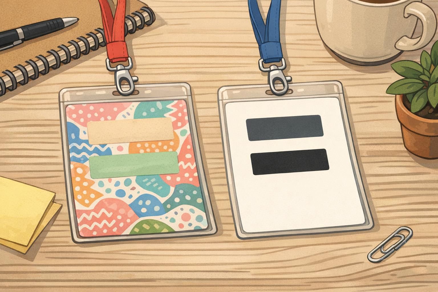
Mistake #2: Low contrast color choices and busy backgrounds
A design that looks sleek on a monitor can fall apart when printed. Gradients, patterns, and photo backgrounds often reduce legibility—especially under typical indoor lighting. Light gray text on a pastel background might look “modern,” but it can be hard to read from even a few feet away.
Before: a gradient-heavy design or a patterned/photo background behind text. After: calm, solid background colors with high-contrast text and enough whitespace to let key information breathe.
- Pick one background color (or a very subtle tint) and keep it consistent.
- Use dark text on a light background or light text on a dark background—avoid “almost the same” tones.
- Reserve stronger colors for small accents (like a role bar), not for behind the name.
- Keep text off textured or photographic areas whenever possible.
Practical fix: print one test sheet and look at it under your real environment lighting (hallway fluorescents, reception desk lighting, warehouse LEDs). If it’s not instantly readable, adjust contrast before you commit to a full run.
Mistake #3: Using too many fonts, sizes, and alignment styles
Typography drift is one of the easiest badge design mistakes to miss—especially when templates get reused by multiple people. Over time, badges end up with mixed font families, inconsistent capitalization, and elements that “float” in slightly different positions from badge to badge. The result looks less professional and takes longer to produce because every new badge becomes a mini redesign.
Before: mixed fonts, inconsistent line spacing, random bolding, and misaligned photo/name blocks. After: a simple system—one sans-serif font family, 2–3 consistent text sizes, and a locked grid so everything aligns across the organization.
- Choose one sans-serif font family for the entire badge system.
- Limit yourself to 2–3 type sizes (example: Name, Role/Department, Secondary info).
- Standardize capitalization rules (example: Name in title case, department in all caps).
- Use a grid: photo box, name box, and role box should land in the same place on every badge.
Consistency is a usability feature. When every badge follows the same layout, people learn where to look—faster identification with less effort.
Mistake #4: Photo and information layout that doesn’t match the real use case
Badges are worn, not just viewed. A design can be technically correct and still fail because of real-world wear: clips cover the top, holders add glare, and lanyards make badges flip. Another common issue is photos that are too small, overly zoomed, or cropped inconsistently—making the badge less useful for quick verification.
Before: the name or photo sits too close to the top slot or near the edges, and the most important information ends up partially covered by the holder or clip. After: build in safe margins, use clear headshots with consistent cropping, and put the name in the most visible area of the badge.
- Leave a safe margin at the top so clips/holders don’t cover the name or photo.
- Use face-forward headshots with a neutral background.
- Standardize cropping (example: same head-and-shoulders framing for everyone).
- Avoid placing critical info near edges where holders and glare can interfere.
Inconsistent cropping and overly small headshots. When the face is too tiny or framed differently badge-to-badge, it slows recognition and makes the set look less uniform.
Yes. Many holders and clips overlap the top portion or add visual clutter near edges. Designing with safe margins prevents important details from being covered during daily wear.
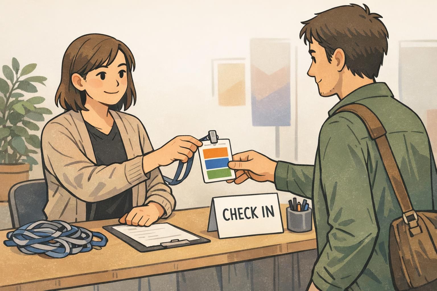
Mistake #5: No system for roles, access cues, or quick visual sorting
Organizations often outgrow a one-size-fits-all badge. At first, everyone’s badge looks the same—until a real workflow needs quick sorting: visitors vs. staff, contractors vs. employees, vendors vs. event attendees. Without a system, teams patch the problem with stickers, handwritten notes, or last-minute color changes that create inconsistency.
Before: everyone’s badge looks identical even when roles differ, causing confusion at check-in desks or on busy floors. After: simple, standardized visual cues that provide context fast without adding clutter.
- Add a small color bar or header band tied to a role category (keep it consistent across print runs).
- Include a role label line (example: Visitor, Contractor, Staff, Vendor) in a predictable location.
- If departments matter, add a department line—short, standardized names work best.
- Avoid creating too many categories; aim for a few that match real decisions people make.
“The moment we added a simple visitor label and a consistent color cue, check-in got calmer. Staff stopped second-guessing who needed an escort.” – Front Desk Coordinator
Mistake #6: Ignoring durability and daily wear (holders, lanyards, and orientation)
A badge can look perfect on paper but become annoying in real use if it smudges, bends, cracks, or flips constantly. This is one of those common badge errors that shows up only after a few weeks—when corners look worn or people start clipping badges in ways that cover important details.
Before: printing without considering lamination, holder compatibility, or whether vertical vs. horizontal orientation fits how the badge is worn. After: choosing materials and accessories that match the environment and standardizing how badges hang and read.
- Pick one orientation (vertical or horizontal) per group whenever possible and design around it.
- Test your layout in the actual holder and attachment method (lanyard, clip, retractable reel).
- Consider finishes that fit the environment—daily wear often benefits from a protective finish to reduce scuffs and smudging.
- Make sure barcodes/QR codes (if used) stay unobstructed when worn.
If you’re standardizing physical ID cards across teams, it also helps to standardize the accessory kit (holder type + lanyard/clip style) so the badge hangs consistently and stays readable.
Mistake #7: Overcomplicating criteria and metadata in digital/open badge programs
Not every badge is physical. For organizations using digital credentials, overcomplexity can dilute value and reduce participation. A huge catalog of overlapping digital badges with vague requirements makes it hard for people to understand what each credential means—and hard for administrators to maintain.
Before: too many badge types, inconsistent naming, and unclear criteria. After: a smaller set of well-defined badges with clear criteria, consistent naming, and metadata that supports verification and reuse across systems.
If you’re issuing open badges, it’s smart to align criteria, metadata, issuance, and verification with an established standard so credentials remain interoperable and maintainable over time (source). This mirrors physical badge best practices: clarity, consistency, and a design system that scales as your program grows.
- Reduce overlap: combine badges that signal the same skill or level.
- Write criteria in plain language so earners know exactly what’s required.
- Use consistent naming and visual structure so the catalog feels cohesive.
- Keep metadata purposeful: enough to verify and understand the credential, not so much that it becomes hard to maintain.
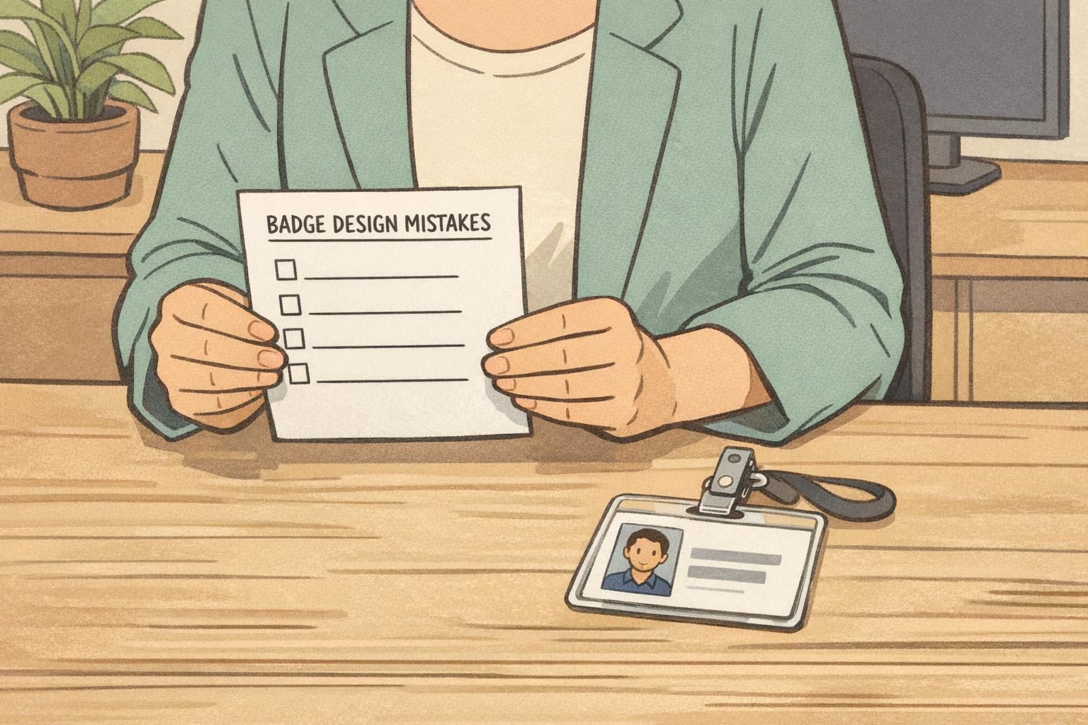
A simple “before/after” checklist you can use to clean up an existing badge system
If your current badges “mostly work,” you don’t need a full redesign. A quick audit can uncover the highest-impact fixes. Think in terms of before/after upgrades: small adjustments that remove friction and make identification smoother in real workflows.
- Readability: Name is the largest element; high contrast; passes the one-second hallway test.
- Typography: One font family; 2–3 text sizes; consistent capitalization and spacing.
- Alignment: Locked grid so names, photos, and titles land in the same place every time.
- Safe margins: Top area protected from clips/holders; key info not near edges.
- Photos: Clear headshots; consistent cropping; neutral background.
- Role cues: Standard labels or color cues for staff/visitor/contractor/vendor (kept minimal and consistent).
- Durability: Layout tested inside a real holder; orientation standardized; finish/material matches daily wear needs.
Run a short pilot: print a handful of revised badges, test them where they’ll actually be worn, gather quick feedback, then lock the template so the improvements don’t drift over time.
Putting fixes into practice with BadgeZoo templates and printing options
Once you’ve defined your layout rules, the fastest way to prevent future drift is to standardize templates and reordering. That means new hires, replacements, and department changes don’t trigger a redesign—just a consistent update within the same system. It also helps events run smoother because check-in teams can rely on predictable formatting and placement.
If you need short-term identification for conferences, trainings, or multi-day onsite projects, it can help to use dedicated event layouts that keep names and roles easy to scan. You can explore options like custom event badges to support those situations while keeping employee ID badges optimized for daily wear.
Whatever tools or vendor you use, the underlying badge best practices stay the same: build a clear information hierarchy, keep contrast strong, lock in typography and alignment, and test the badge in the real environment (holder, lanyard, lighting, and workflow). That’s how you reduce rework, improve professionalism, and make identification easier for everyone.
