Minimalist ID Badge Design: Clean, Modern, and Easy to Read
Why Minimalist ID Badge Design Looks Premium and Reads Faster
A minimalist ID badge works because it respects how people actually scan information: fast, from a few feet away, often while walking or mid-conversation. When the design removes distractions, the eye lands immediately on what matters—name, role, and organization—without hunting through extra shapes, lines, or decorative elements.
This approach also tends to feel more “premium” because it’s harder to hide behind clutter. Minimal layouts depend on confident typography, deliberate spacing, and a small number of well-chosen colors. Instead of adding more, the design earns its polish by making every element pull its weight.
In practical settings—workplaces, schools, conferences, and visitor check-ins—faster recognition supports smoother introductions, clearer wayfinding, and everyday security checks. Minimalism isn’t about making badges boring; it’s about making them instantly understandable.
This aligns with a broader design principle: minimalist design prioritizes simplicity and clarity by removing unnecessary elements, which can improve quick comprehension while maintaining an elegant appearance (source). On an ID badge, that “quick comprehension” is the whole job.
A badge that looks clean is nice. A badge that reads quickly is useful. Minimal design helps you achieve both at once.
The Non-Negotiables: Information Hierarchy for a Clean Badge
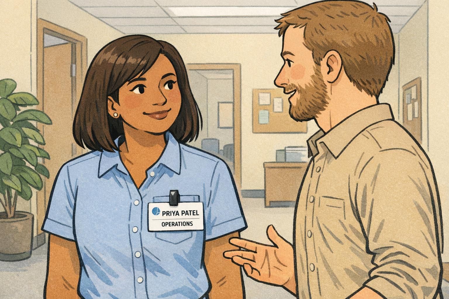
Minimal design only works when the information hierarchy is crystal clear. If you strip out visual noise but also shrink or bury the name, you haven’t made a better badge—you’ve just made a quieter one. The goal is a clean name tag that still communicates identity instantly.
A reliable hierarchy for most workplaces and events looks like this:
- Primary: Person’s name (largest, highest contrast, easiest to spot)
- Secondary: One supporting line (role, department, or attendee type like “Visitor” or “Speaker”)
- Optional: Organization details only if needed (for multi-company events, campuses, or shared facilities)
Use size and font weight changes to show importance, not a rainbow of colors or multiple decorative containers. One bold weight for the name and a regular weight for the secondary line is often enough to establish a calm, modern hierarchy.
Keep icons minimal and functional. A logo can help immediate recognition (especially for security or wayfinding), but it shouldn’t compete with the name. If the logo doesn’t improve recognition in your specific setting, it may be better left out.
No. Include a logo only when it helps quick recognition (for example, multiple organizations at one site). If the logo crowds the name or forces the text to shrink, the badge will be harder to read.
Giving the organization or design elements equal visual weight as the name. If the name isn’t clearly dominant, introductions and quick checks slow down.
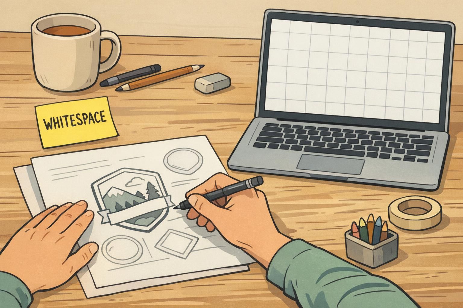
Simple Badge Design Rules: Whitespace, Alignment, and a Grid
A simple badge design becomes much easier when you commit to a grid. You don’t need advanced graphic design software knowledge to benefit from this—just decide on consistent margins and a predictable alignment, then stick to it across every badge.
Whitespace (empty space) is not “unused.” It’s the tool that makes a minimal layout feel intentional instead of cramped. Generous margins and consistent spacing between elements help the eye separate the name from the role line, and they reduce the chance that the badge feels busy even with limited content.
- Start with generous outer margins (a consistent safe zone around all edges)
- Use one alignment system (often left-aligned text blocks for quick scanning)
- Keep spacing consistent: name-to-role spacing should repeat across badges
- If you include a photo, give it breathing room so the text doesn’t feel crowded
Avoid mixing alignments—like centering the name while left-aligning the role—unless there’s a strong reason and the grid still feels consistent. Most of the time, a single alignment choice reads as “clean” instantly.
A fast gut-check: if you remove the logo or a divider line and nothing breaks, your layout is probably truly minimalist.
Contrast and Readability: Make It Legible from 3–6 Feet Away
Minimalism depends on contrast. If the badge relies on pale gray text on an off-white background, it may look sleek on screen but fail in real life—especially under overhead lighting or across a hallway.
Aim for a straightforward contrast relationship: dark text on a light background (or the reverse). Keep the palette simple and predictable so the name line always wins. This is one of the quickest ways to make a clean name tag that actually performs in busy environments.
- Use high-contrast text for the name (avoid low-contrast gray-on-gray combinations)
- Choose one typeface family and limit styles (for example, regular + bold)
- Avoid condensed fonts for names; prioritize letter clarity at a glance
- Keep the name line visually dominant even if a photo is included
If your badge includes a photo, keep the photo background simple and avoid placing critical text over imagery. The badge should support quick human recognition, not compete with it.
Layout Examples: 3 Minimal Templates You Can Mix and Match
Minimal templates work because they’re repeatable. Once you settle on a structure, you can apply it across employees, visitors, vendors, volunteers, and event attendees with only small changes to the secondary line. The goal is consistency: the viewer always knows where to look first.
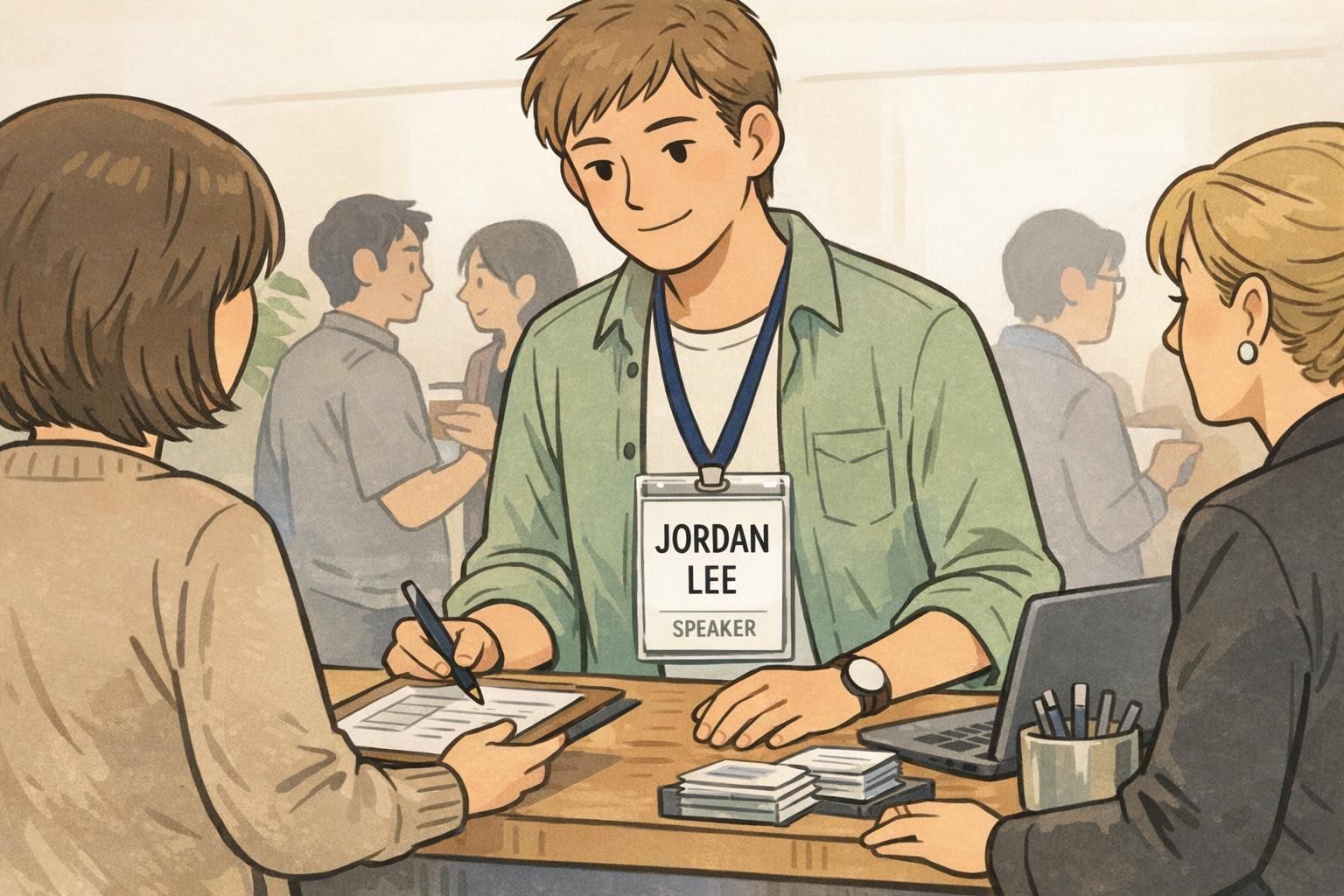
- Template A (Everyday Workplace ID): Large name, small role line, small logo in one corner. Great for daily use where the name is the main point.
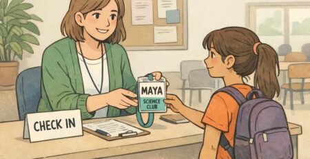
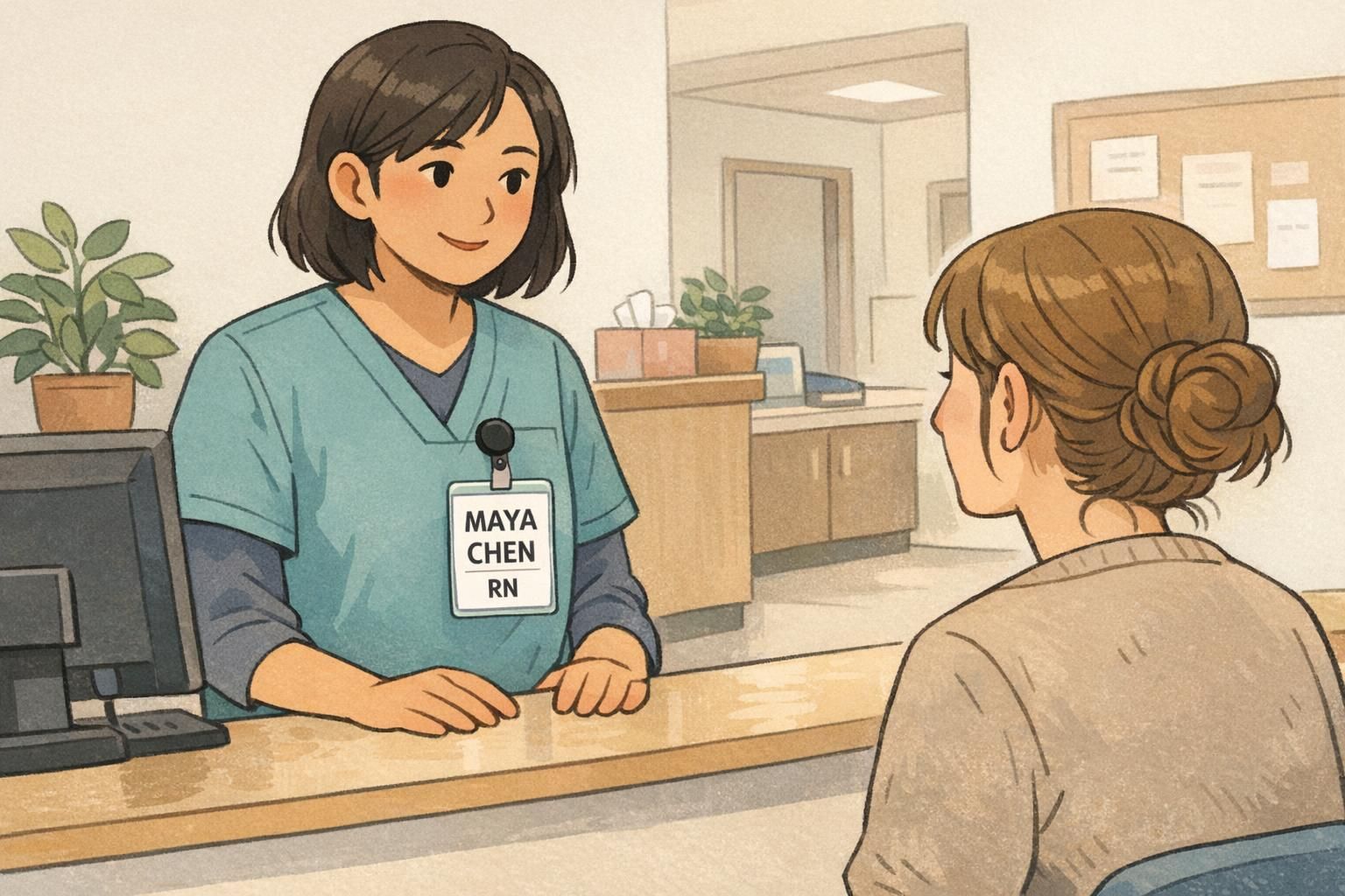
- Template B (Photo-Forward ID): Photo on the left, text on the right with wide margins. Best when quick face matching is important at doors, receptions, or clinical settings.
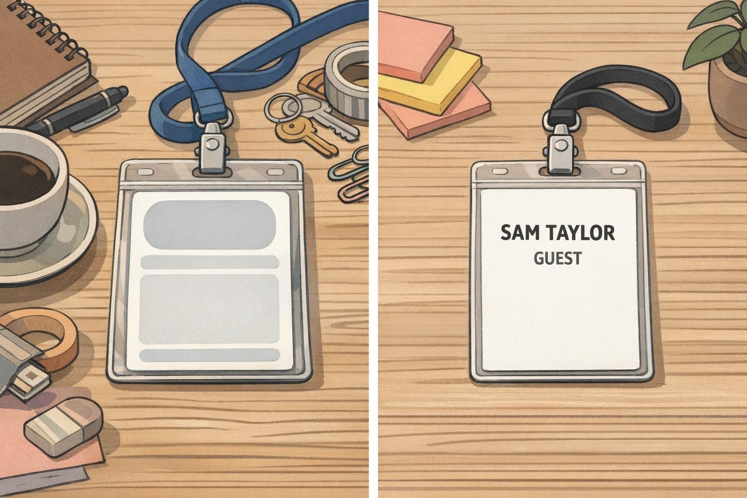
- Template C (Text-Only + Subtle Color Band): No photo, strong typography, and a thin color band for quick category cues. Ideal for visitors, short-term access, or quick-turn events where speed and cost matter.
If you need a simple badge design for an event, these same templates translate well—just adjust the supporting line from a job title to a company name or attendee type. The cleaner the layout, the easier it is for people to start conversations without squinting.
Printing and Materials That Support Minimalism (Without Overcomplicating It)
A minimal layout puts more pressure on production quality. When the design is clean, small issues—fuzzy edges, smudged fine text, glare—stand out quickly. The good news is you don’t need to over-engineer it; you just need materials and printing choices that protect legibility.
If your layout uses small text, thin rules, or subtle spacing, crisp printing helps everything look intentional. Finishes matter too: matte surfaces can reduce glare under overhead lights, which supports readability in lobbies, hallways, and conference floors.
- Choose a finish that matches your environment (matte can help reduce glare)
- Use durable materials when badges will be worn repeatedly so they stay clean-looking
- Pair the design with the right attachment (lanyard, clip, or holder) so the badge stays straight and readable
- Standardize badge sizes across teams so templates remain consistent
If you’re producing badges through BadgeZoo, multiple finishes are available (including matte/silk) so you can match the feel of minimalism to the lighting and wear-and-tear of your setting without changing the layout itself.
Where Minimal Design Helps Most: Offices, Healthcare, Schools, and Events
Minimal design shines wherever people need to identify each other quickly, politely, and repeatedly. When badges are part of everyday movement—walking into meetings, passing in hallways, greeting visitors—clarity is not a luxury; it’s what keeps interactions smooth.
In offices, a minimalist ID badge helps new hires, visitors, and cross-team collaborators confirm names quickly during introductions. It also supports routine security moments—like confirming someone belongs in a controlled area—without making the environment feel harsh or overly bureaucratic.
In healthcare and schools, high-traffic hallways and time-sensitive interactions make readability even more important. Staff, students, parents, and patients benefit when the badge communicates the name and role instantly, with no unnecessary visual complexity.
At conferences, minimal event badges reduce visual noise so attendee names and companies stand out during conversations. In networking-heavy environments, that’s a practical advantage: fewer awkward pauses, fewer “Sorry—what was your name again?” moments, and quicker connections.
“When everyone’s badge follows the same clean structure, you stop ‘decoding’ badges and start recognizing people.” – Facilities Coordinator
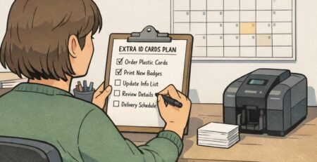
Ordering Tips: Turning Your Minimal Layout into Consistent, On-Brand Badges
Minimalism looks best when it’s consistent. The fastest way to lose the benefits of a minimalist ID badge system is to let every team improvise fonts, spacing, and placement. Instead, lock in a small set of rules so every badge feels like part of the same family.
- Choose one font family and stick to it
- Limit yourself to two font weights (often regular + bold)
- Use a small, consistent color palette (one primary text color, one secondary tone, and an optional accent)
- Standardize placement for name, photo (if used), and logo (if used)
- Create one master template for employees and a simplified variant for visitors
A visitor badge is a great place to go even simpler: name + “Visitor” (or another clear label) is often enough. This keeps check-ins fast while still supporting workplace identification and everyday security.
When you’re ready to produce, a reliable supplier helps maintain consistency across reorders—especially for color matching and crisp small text. If you’re building or refreshing your system, BadgeZoo’s custom ID badges can support a repeatable template approach so the clean layout you design is the clean layout you receive.
If you want a minimalist system that stays minimalist over time, standardize the template first—then scale production. Consistency is what makes minimal design feel premium.