Networking Name Tag Ideas That Actually Help People Meet at Events
Why a Networking Name Tag Should Do More Than Show a Name
A networking name tag is often the first “introduction” people see. Before anyone says hello, the tag is already doing social work: it reduces uncertainty, signals approachability, and helps someone decide how to start a conversation. When the layout is hard to read or overloaded, it creates friction—people lean in, squint, or default to the same awkward opener: “Sorry, what was your name again?”
The best tags are designed for humans in motion. People are walking, holding drinks, turning sideways, and talking in noisy rooms. A readable hierarchy (what your eye catches first, second, and third) lets someone recognize you from a few feet away, greet you confidently, and move straight into a meaningful exchange. Think of it as a tiny interface: the clearer it is, the easier the interaction.
- Design for distance first: can someone read the key info from 3–6 feet away?
- Prioritize a single goal: make conference introductions easier and less repetitive
- Use the rest of the space to invite conversation, not to cram details
Make First Names Big: The #1 Readability Choice That Sparks Hellos
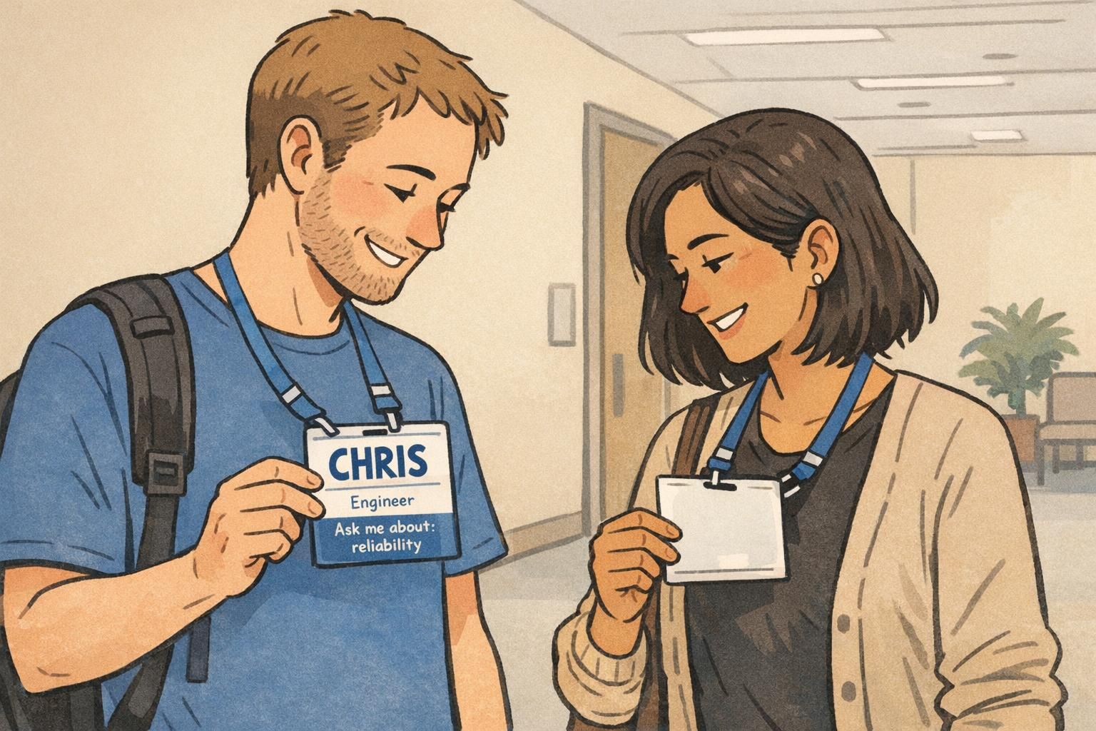
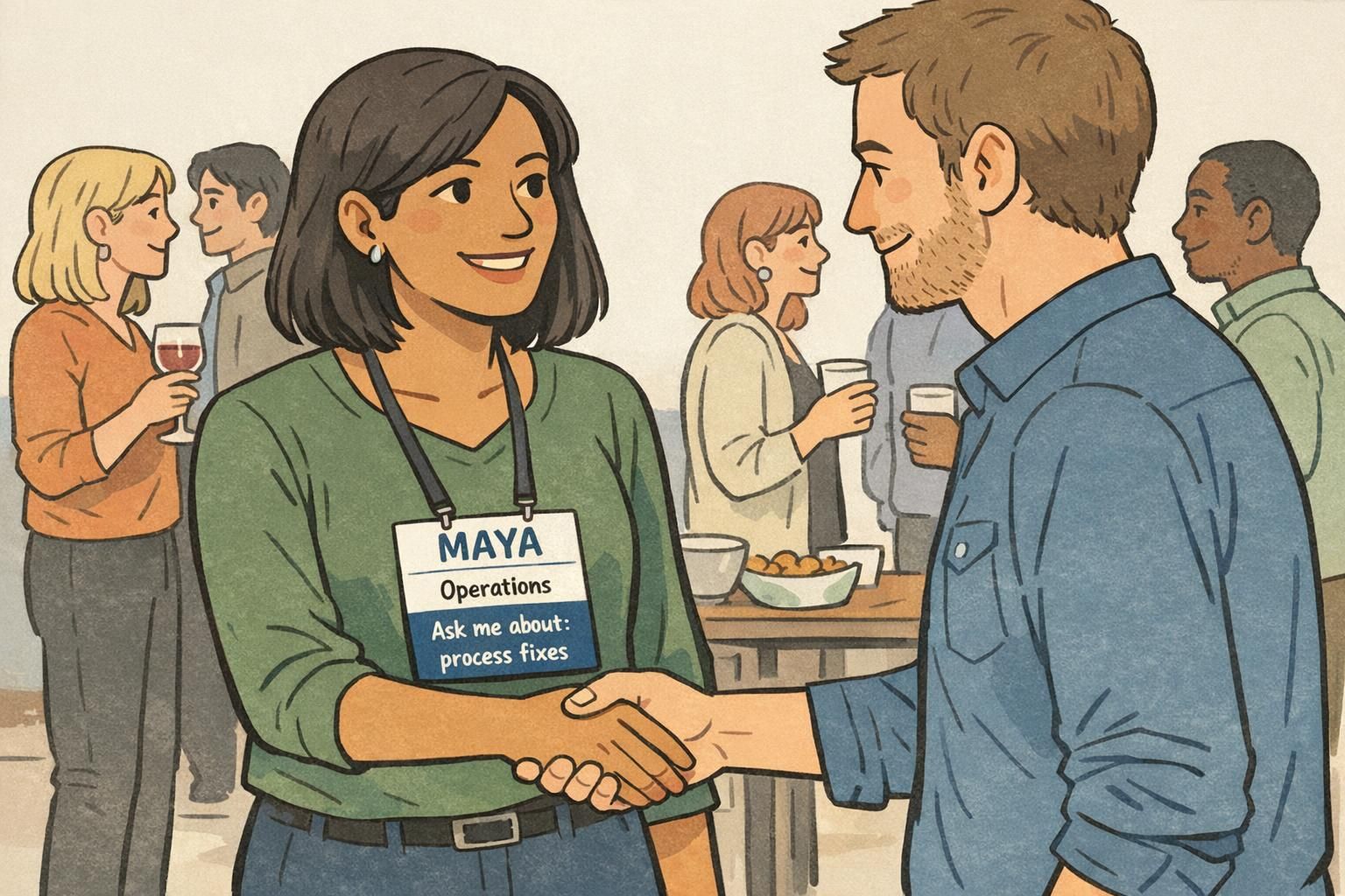
If you change only one thing on a networking name tag, make the first name the largest element. In most rooms, it’s the only line that’s reliably readable at a glance—and it’s the line people need to start a friendly greeting. When someone can say “Hi, Maya” with confidence, you’ve already removed a common social barrier.
Keep the last name smaller (or even optional, depending on your event’s culture) so it doesn’t visually compete with the first name. Pair that with high contrast—dark text on a light background is usually the simplest win—and choose a clean sans-serif font that won’t disappear in low light. Thin or decorative fonts can look stylish on a screen, but they often fail in real-world, fast-moving conversations.
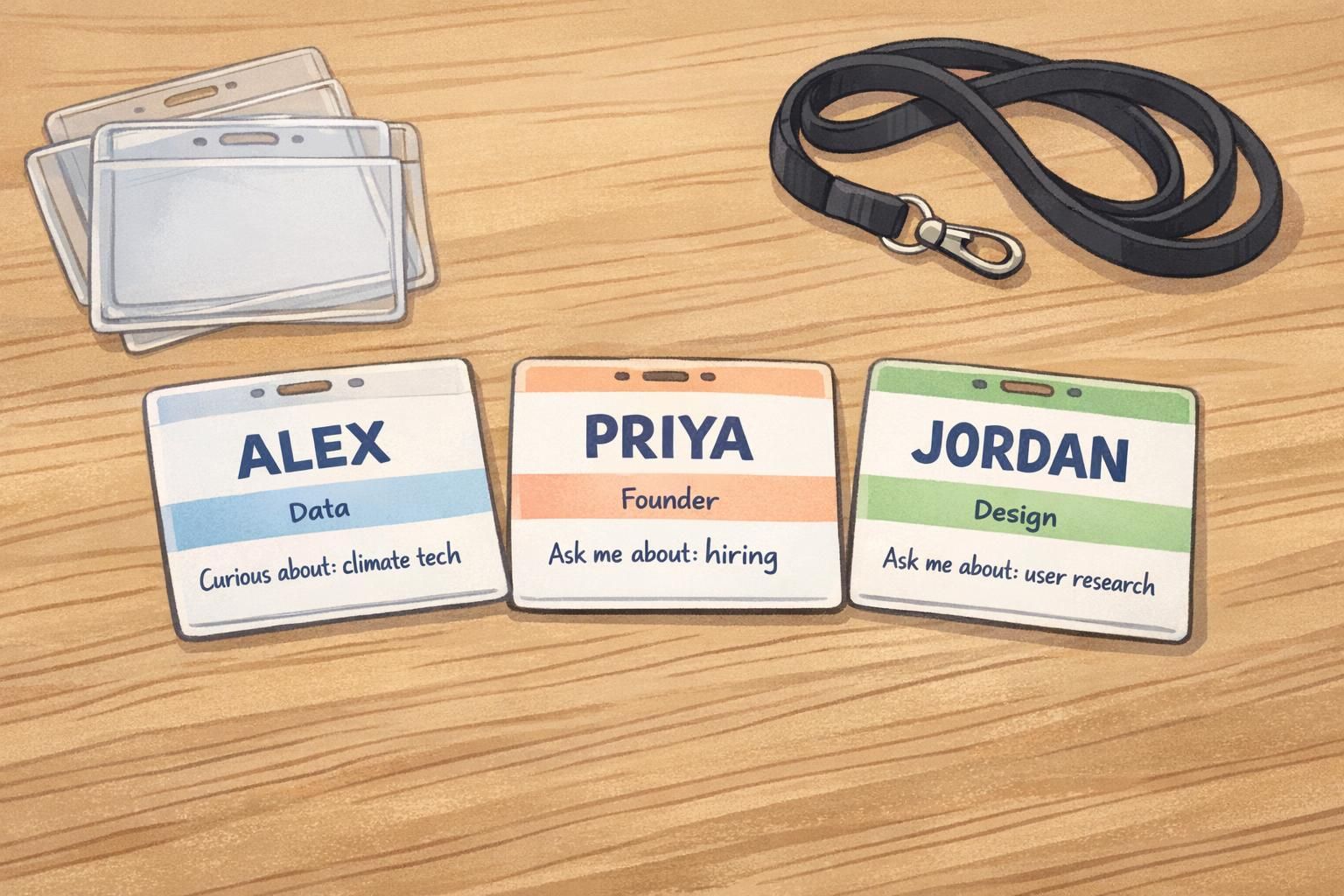
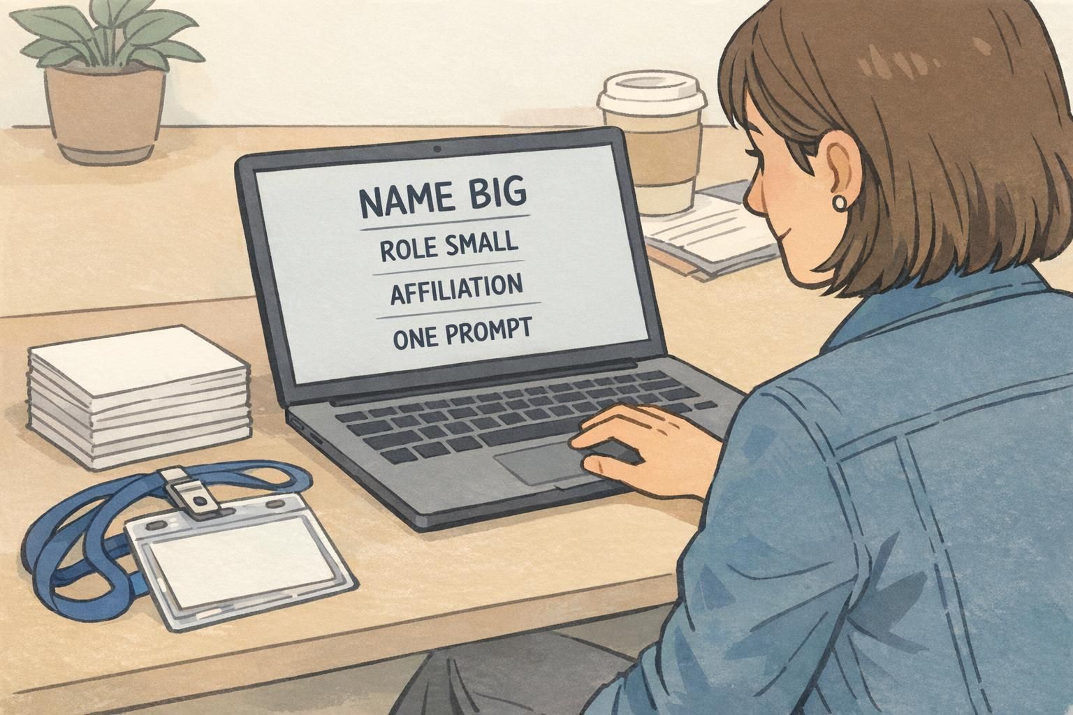
A simple hierarchy works best: FIRST NAME (largest) → role/affiliation (smaller) → one conversation prompt (smallest).
- Use a bold, simple sans-serif font for the first name
- Avoid ALL CAPS for smaller lines if it hurts readability (caps can reduce letter-shape recognition)
- Leave comfortable whitespace so the name doesn’t feel cramped
- Test the tag at arm’s length and from across a small room
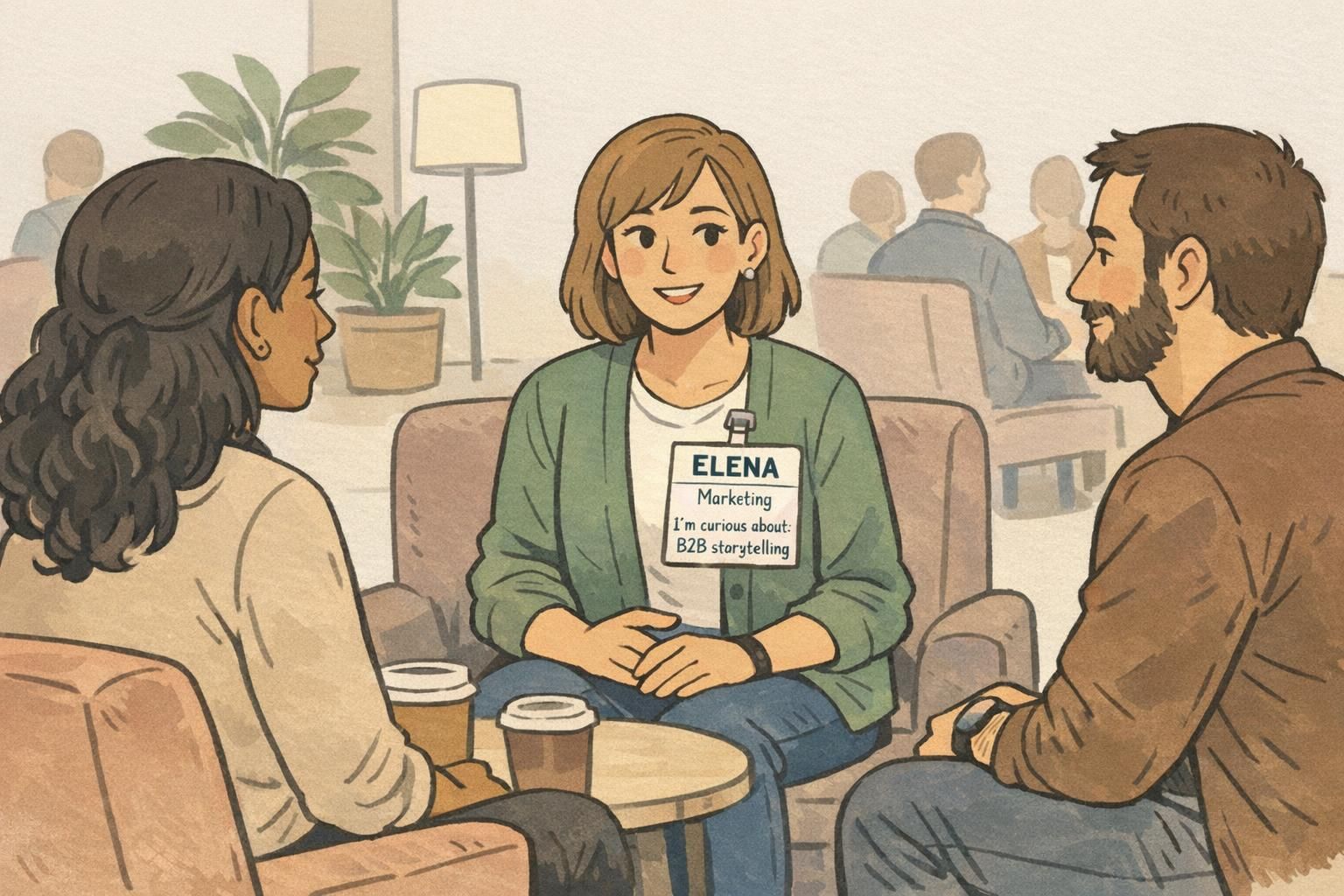
Add Small Conversation Prompts (Without Turning It Into a Questionnaire)
Once the name is readable, the next best upgrade is a small conversation prompt. This is a short line that gives someone an easy, non-invasive way to start talking—especially helpful for first-time attendees, introverts, or anyone walking into a room where “So, what do you do?” feels tired.
Keep it optional and brief. Think one line or a few keywords, not a form. The prompt works best when it invites stories, practical expertise, or shared curiosity rather than personal details. Examples that tend to land well include “Ask me about: process fixes,” “I’m curious about: AI policy,” or “Currently learning: customer research.”
This idea lines up with a broader event-planning theme: structured icebreakers and attendee-friendly design can reduce friction and improve networking. If you want more general reading on attendee experience and networking-friendly planning approaches, Eventbrite’s event resource hub is a solid starting point: source.
- Good prompt starters: “Ask me about: …”, “I’m curious about: …”, “I can help with: …”
- Keep it specific enough to be meaningful, broad enough to be approachable
- Avoid prompts that require sensitive personal info or feel like a personality test
- If the event is formal, keep the tone professional and topic-based
Usually no. Making prompts optional keeps the tag inclusive and reduces pressure. Many events offer a default (like leaving the line blank) so the layout stays consistent without forcing participation.
Set a character limit on the template (or provide a short dropdown list of topics). A prompt that’s too long becomes unreadable and competes with the name.
“The best prompts don’t try to describe a whole person—they give a single handle someone can grab to start a real conversation.” – Event organizer
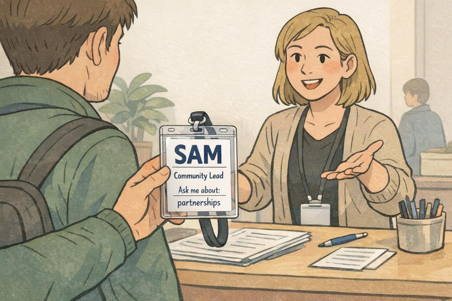
Put Affiliation Where It Helps: Company, Role, or Community Placement
Affiliation helps people orient quickly: who you are in the professional sense, and why you might be relevant to talk to. But it should support introductions—not crowd them. Place company/organization and role beneath the name in smaller text so the eye naturally lands on the greeting first, then the context.
This is especially useful in busy spaces where someone may remember “the Community Lead from that nonprofit” even if they blank on the name. It also helps follow-up: if you meet three people named Sam, the affiliation line helps you sort the memory later.
If your event includes multiple communities—sponsors, speakers, exhibitors, staff—consider a simple label that makes the room navigable without making anyone feel separated. The key is subtle clarity: a small line like “Speaker” or “Exhibitor” can prevent confusion, while still keeping the primary layout consistent for everyone.
- Place role and organization on one or two short lines under the name
- Use smaller font size than the first name, with the same clean typeface
- If using group labels (Speaker/Staff), keep them consistent and unobtrusive
- Avoid oversized logos that push the name down or shrink it
Color and Icons: Quick Grouping by Track, Industry, or Interest (Used Carefully)
Color and icons can make a room easier to navigate. A small color bar or a simple icon can help attendees spot others in the same track, region, or interest area without forcing anyone into a rigid label. Done well, it’s a gentle way to reduce the “Who should I talk to?” problem in large crowds.
The danger is visual noise. Too many colors, too many symbols, or poor contrast can make the main purpose—readability—worse. Aim for minimal, consistent iconography and colors that remain clear under indoor lighting. It’s also smart to ensure the design still makes sense if printed in black and white (or viewed by someone with color-vision differences).
If color or icons ever compete with the first name, the color/icons are too strong.
- Use one small icon or one small color bar—avoid mixing multiple systems
- Keep the name area clean with high contrast
- Choose colors that still look distinct when muted or printed
- Use the same placements across all tags so attendees learn the pattern quickly
Practical Format Choices: Sticker vs Holder, Orientation, and Scan-Friendly Add-ons
A great layout can still fail if the format doesn’t match how people move and dress at your event. Adhesive sticker name tags are fast and convenient, especially for short meetups or casual mixers. But holders with clips or lanyards tend to stay visible and professional all day—particularly at multi-session events where people are standing, sitting, and shifting layers.
Orientation matters more than it seems. Portrait orientation often supports the clean hierarchy that helps conference introductions: big first name, then role/affiliation, then a short prompt line. Landscape can work well when you truly need horizontal space (for example, a wide logo), but be careful that the name doesn’t shrink to accommodate it.
If you add a QR code for a profile or schedule, keep it secondary. The tag should still work even if no one scans anything. A QR code is a nice extra, but the primary interaction at a networking event is still face-to-face: greeting, context, then conversation.
- Stickers: quick distribution, best for short events; can wrinkle or become hidden by jackets
- Holders + lanyards: durable and visible; better for multi-day conferences
- Portrait layout: supports large first names and a clear prompt line
- QR codes: place low on the badge and smaller than the name to avoid competition
Event Name Badge Layout Templates You Can Standardize for the Whole Room
A standardized event name badge template makes the entire room easier to read. When every badge follows the same structure—name in the same place, role/affiliation in the same place, prompt line in the same place—attendees don’t have to “decode” each new tag. That consistency speeds up recognition and lowers social effort across dozens of micro-interactions.
Standardization also helps organizers. It simplifies pre-printing, onsite edits, and quick replacements if a badge is lost or misprinted. And for larger events, it reduces check-in bottlenecks because staff aren’t making layout decisions on the fly.
For speakers, staff, and vendors, you can keep the same template while adding a small, consistent identifier (like a subtle label line or color accent). The goal is clarity without creating a social wall. People should still feel like they can approach anyone.
- Template rule: first name biggest, always in the same top position
- Second line: role (or role + company), short and readable
- Third line: one optional prompt (or leave blank if not used)
- Optional: small group label (Speaker/Staff/Exhibitor) placed consistently
- Keep logos small so the content remains the hero
Where BadgeZoo Fits: Printing Options That Support Readable, Conversation-Ready Tags
Once you’ve settled on a readable layout, consistent materials and printing help it stay clear from check-in through the last session. For example, choosing the right badge holder style can keep the badge facing forward, reduce glare, and protect inserts from bending—small factors that add up when people are moving around all day.
BadgeZoo supports event badges and name tags designed for clarity, along with accessories like holders and lanyards that keep information visible. If you’re building a standard template for the whole room, having a reliable way to print consistent badges (and handle reprints) helps your design do its job without drama.
For events that need flexibility—like last-minute attendee changes—there’s also no minimum order quantity, which can make it easier to match what you print to what you actually need.
If you’re exploring options for a full set that includes the wearable pieces, you can start with BadgeZoo’s custom event badges.
Quick Checklist: A Friendly, Readable Tag People Will Actually Use
A good networking name tag is a small tool that supports real human connection. Before you finalize print files, run a quick reality check: can someone greet you without leaning in, and can they find an easy opener without reading a wall of text?
- First name is the biggest element and readable from 3–6 feet away
- Last name (if included) is smaller and doesn’t compete visually
- Affiliation (company/role/community) sits consistently under the name
- One short prompt line exists (optional), and it’s scannable in a second
- No clutter: oversized logos, too many icons, or long titles are trimmed
- Colors and icons remain clear and accessible, even if printed simply
- Any QR code is secondary and doesn’t pull attention from the name
- You’ve tested the badge under typical indoor lighting and at real angles
If you want better conference introductions, prioritize what a stranger needs in the first five seconds: a readable name, a bit of context, and a simple way to start talking.
Shrinking the name to make room for everything else. When the name isn’t readable, the badge stops helping and people revert to awkward repeats and missed connections.
Usually only if they’re essential to the event’s purpose. If you do include them, keep them small and consider shortening titles so the name remains the visual priority.