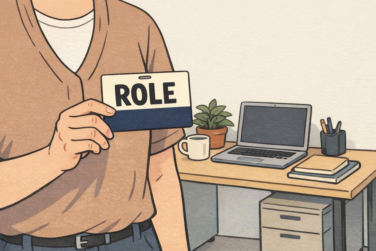
Role Identifier Card Design: How to Make Role Cards Pop Without Looking Loud
What makes a role identifier card feel clear and polished
A well-made role identifier card should be easy to understand in a split second. The best designs use hierarchy, spacing, and restraint so the most important information is the first thing the eye sees. That is what makes a card feel polished: not extra decoration, but a layout that is calm, organized, and quick to scan. In workplaces, events, and service settings, clarity matters because people need to recognize roles fast without stopping to decode the design.
For that reason, good badge layout can stand out through structure and contrast instead of bright graphics or crowded visuals. A clean role card can feel more confident and professional when the role line is given room to breathe and everything else supports it quietly.
badge buddy design for readable role cards
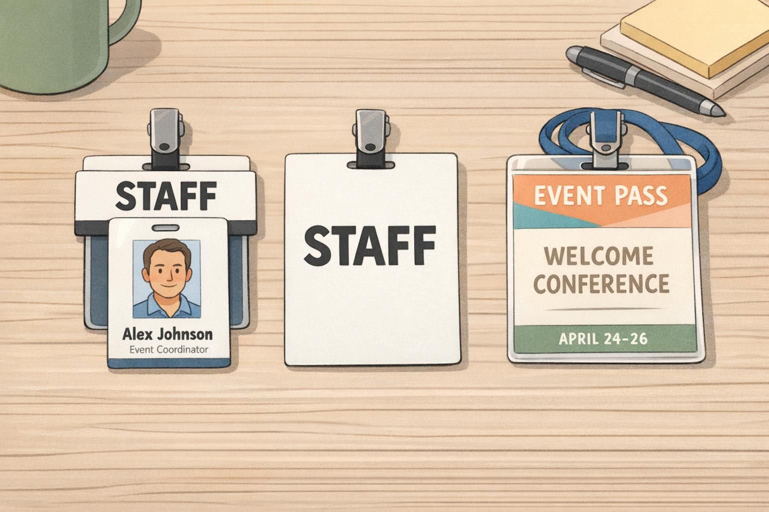
badge buddy design works well when the role line needs a simple, high-visibility placement without adding clutter. A badge buddy can sit with an ID badge and do one job very clearly: make the role easier to spot. When the wording is concise and the color blocking is clean, the design helps teams identify who someone is and what they do without forcing the reader to search the card.
This format is especially useful when a standard ID badge already carries a name, photo, or other required details. The badge buddy adds role recognition beside it, while keeping the system neat and easy to read. In some settings, though, a separate role card format may make more sense if the role itself needs to be the main message or if the identification piece must be read from farther away.
Use a badge buddy when you want role recognition to feel immediate, but still want the overall identification setup to look orderly and professional.
Choose contrast, spacing, and typography that stay professional
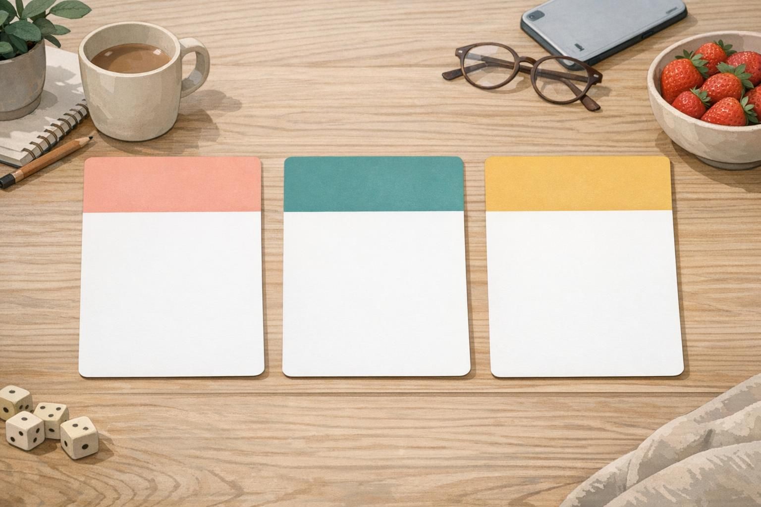
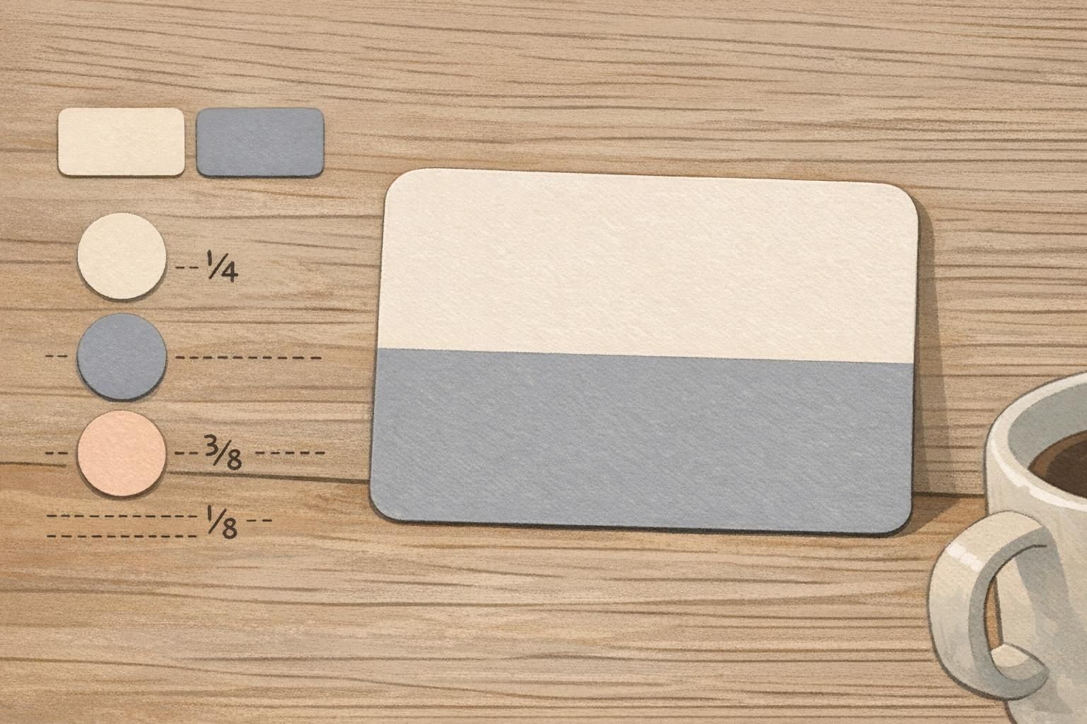
To make a readable role badge stand out without feeling loud, start with muted colors and strong contrast. Soft neutrals, deep navy, charcoal, or other restrained color blocks can create enough separation for the role text to pop. Generous white space is just as important, because it keeps the card from feeling crowded and gives the viewer a clear visual path.
Typography should be bold where it matters, but used sparingly. The role title should carry the most weight, while secondary details stay smaller and lighter. Small icons or subtle separators can help with scanning, but they should never compete with the main role line. If the layout feels balanced and steady, the card will read as professional rather than flashy.
- Use one dominant role line.
- Keep supporting details smaller and quieter.
- Rely on contrast, not excess color.
- Leave enough empty space around the text.
- Let simple blocks and alignment do the work.
Layout patterns that help big role text remain easy to read
One of the most reliable ways to design a role identifier card is to place the large role text above or beside secondary information such as department, company, or name. Predictable alignment helps the eye know where to go first, and simple blocks keep the information from competing with itself. This is what makes big role text easy to read without looking oversized or aggressive.
A strong type scale matters here. The role line should be the largest element, the next details should be clearly secondary, and every block should align cleanly so the card feels intentional. When the eye can move in one direction, the design becomes faster to scan and easier to trust.
Clear role cards work best when the viewer can understand the message without pausing. The layout should guide the eye, not challenge it.
Material and finish choices that add quiet visual pop
Not all visual impact has to come from color. Matte finishes, soft textures, rounded corners, and subtle specialty materials can give a card presence while keeping the design calm. Those details add quiet visual pop because they change how the card feels in the hand and how the surface catches light, without creating extra noise on the card itself.
This kind of restrained finish can also support accessibility and durability, which matters in high-use identification settings. When a card is handled often, a practical surface and sturdy form can help it stay readable and usable longer. Subtle design choices can make the card feel premium while still serving its main purpose: clear identification.
That approach aligns with research on symbolic, well-structured design, which suggests that memorable visuals do not need to be loud to be effective; clarity and organization can create stronger recognition than saturation or visual clutter. source
Readable role badge examples for workplaces and events
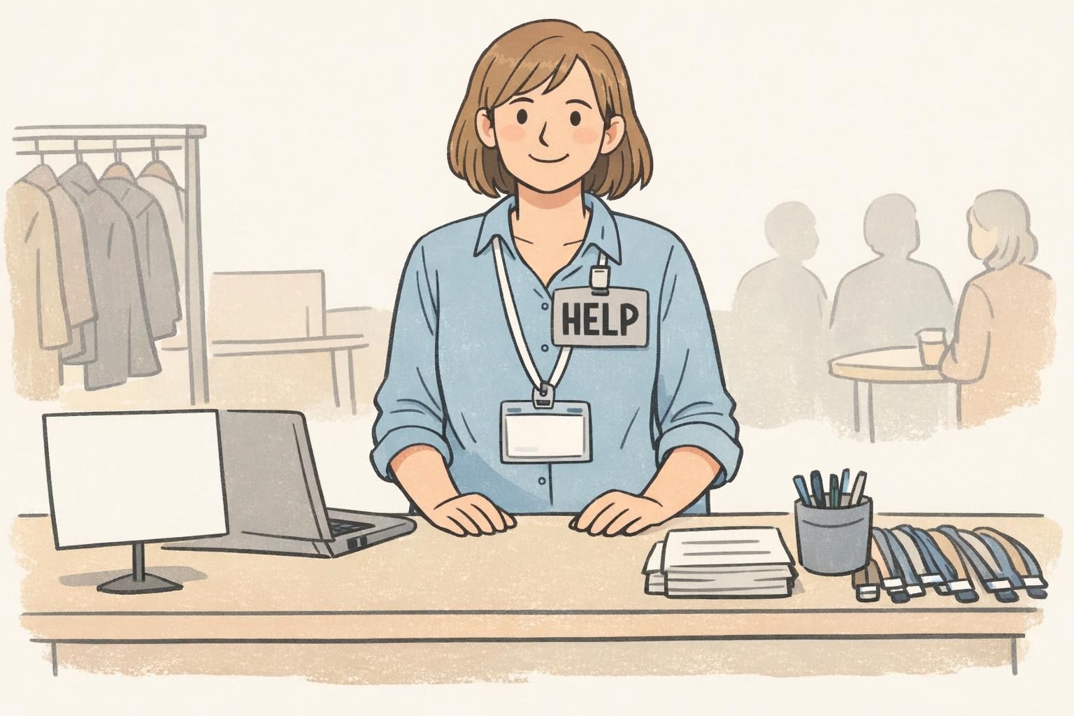
A readable role badge can adapt to many common settings. In hospitals, the role must often be understood quickly and under pressure. In schools, it can help visitors and staff find the right person without confusion. At conferences, a clear role card can support fast networking and smoother check-in. In retail teams, it can help customers identify who can assist them. In visitor settings, it can make the right point of contact obvious at a glance.
The best version depends on the environment, distance, and how quickly people need to identify a role. A card meant for close-up conversations may use smaller supporting details, while a card for larger rooms or busy entry points may benefit from bigger role text and stronger contrast. The point is not to make every card look the same, but to match the format to the real-world use case.
- Hospitals: prioritize fast recognition and clear hierarchy.
- Schools: keep role wording simple and friendly.
- Conferences: make the role line easy to read at check-in distance.
- Retail: emphasize staff visibility without clutter.
- Visitor areas: focus on immediate role clarity.
How to proof, test, and refine role card designs
Before production, it helps to review the role identifier card in a simple, practical way. First, look at it at the distance where people will actually see it. Then confirm that the role text is the dominant element and that the contrast still works in real lighting. Finally, check whether the color blocks feel calm and professional rather than busy or harsh.
A small test with staff or event teams can be very useful, because they know what people need to read first. Their feedback may reveal that a line is too small, a block is too dense, or a layout feels less readable than expected. Refining the design this way helps the card work better in real use, not just on screen.
Check legibility at real-world distance, then make sure the role line is the most dominant element on the card.
If the card uses too many colors, too much text, or tight spacing, it usually feels busier than it needs to be.
The people using the card every day can quickly point out whether the layout helps or slows down recognition.
Choose the right BadgeZoo format for your identification setup
The right choice depends on whether you need a name tag, a badge buddy, an event badge, or another role-focused identification piece. A role identifier card is ideal when the role must read clearly on its own, while a badge buddy can work well when you want to pair role visibility with an existing ID badge. In some cases, a ready-made format is the simplest way to turn these design principles into a practical setup.
If you are comparing formats for your team or event, badge buddies for clear role identification can be a helpful place to start. BadgeZoo supports clear, professional identification across everyday operations, and the goal is always the same: make the right information easy to see without making the card feel loud.