QR Code Badge Implementation Mistakes: Sizing, Placement, Contrast, and Testing
Why QR Code Badge Scans Fail More Often Than They Should
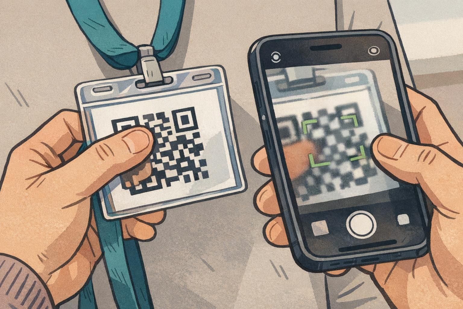
A QR code badge is supposed to remove friction: one quick scan at check-in, a fast door access confirmation, or a simple way to pull up a profile or training record. In the real world, though, badge scanning happens in moving lines, mixed lighting, and on many different phone cameras. Small design and production decisions can turn a “tap to scan” moment into repeated attempts and a growing queue.
Most QR code errors are preventable. They tend to come from the same few categories: the code is too small for the scan distance, the placement is easy to cover or damage, the contrast is too low for reliable detection, or the final printed piece doesn’t match what was tested on-screen. The good news is that you don’t need an overhaul—just a practical approach to sizing, placement, contrast, and a short test routine before you approve a full print run.
If your QR code scans well on a monitor but struggles on a worn badge in real lighting, treat it as a layout-and-production problem first—not a user problem.
Sizing Mistakes: When the Code Is Too Small (or Overstuffed With Data)
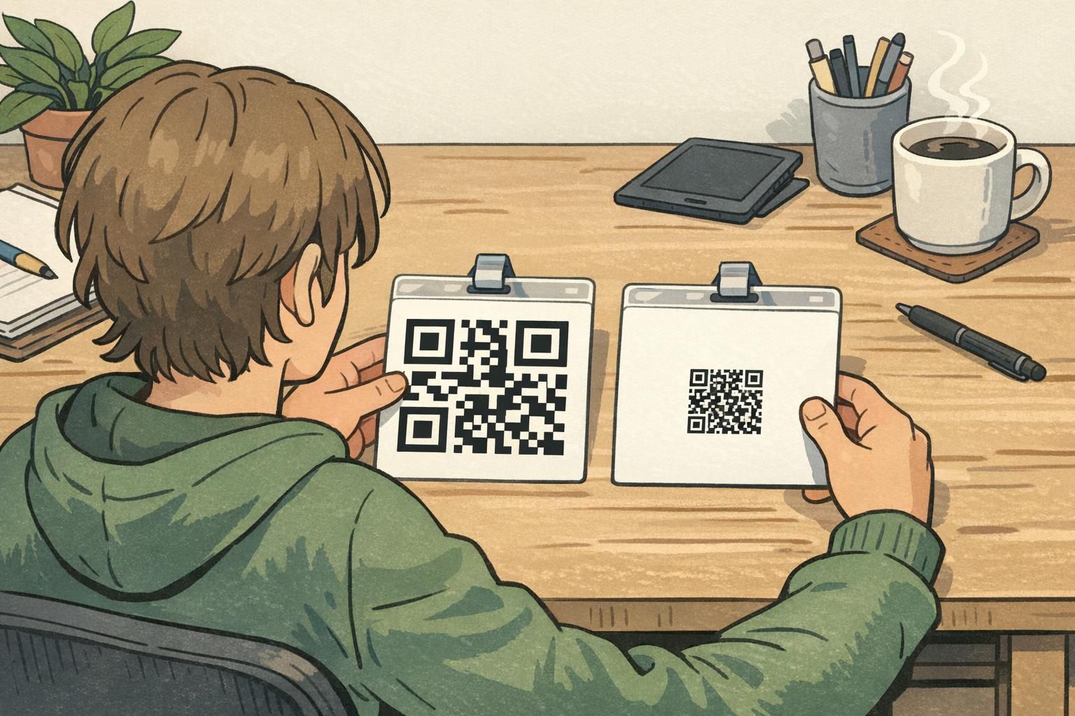
The most common reason a QR code fails on a badge is physical size. If the QR code is printed too small, the phone camera can’t resolve the tiny squares (modules) quickly—especially when the badge is moving on a lanyard or the scanner is held at arm’s length.
A second, closely related issue is density. When you encode too much information directly into the QR code (long URLs, multiple fields, large tokens), the code becomes more complex: more modules packed into the same area. That density makes the QR code less forgiving of real-world problems like slight blur, glare from a holder, or a print that’s a little soft.
- Avoid encoding long strings when a short URL or simple ID can point to the same destination.
- Keep the printed QR code large enough for the expected scan distance (for example, quick scans at a doorway versus close-up scans at a desk).
- Preserve a clear quiet zone (blank margin) around the entire code so scanners can detect the edges reliably.
- Don’t “shrink to fit” at the last minute to make room for design elements—resize the layout instead.
Screens are bright, flat, and high-contrast. Printed badges can be smaller, slightly blurred from printing, affected by lighting, and often sit behind glossy plastic—all of which makes small or dense codes harder to read.
When possible, linking via a short URL or ID typically improves scan reliability because it reduces QR density, making the code easier for phone cameras to decode.
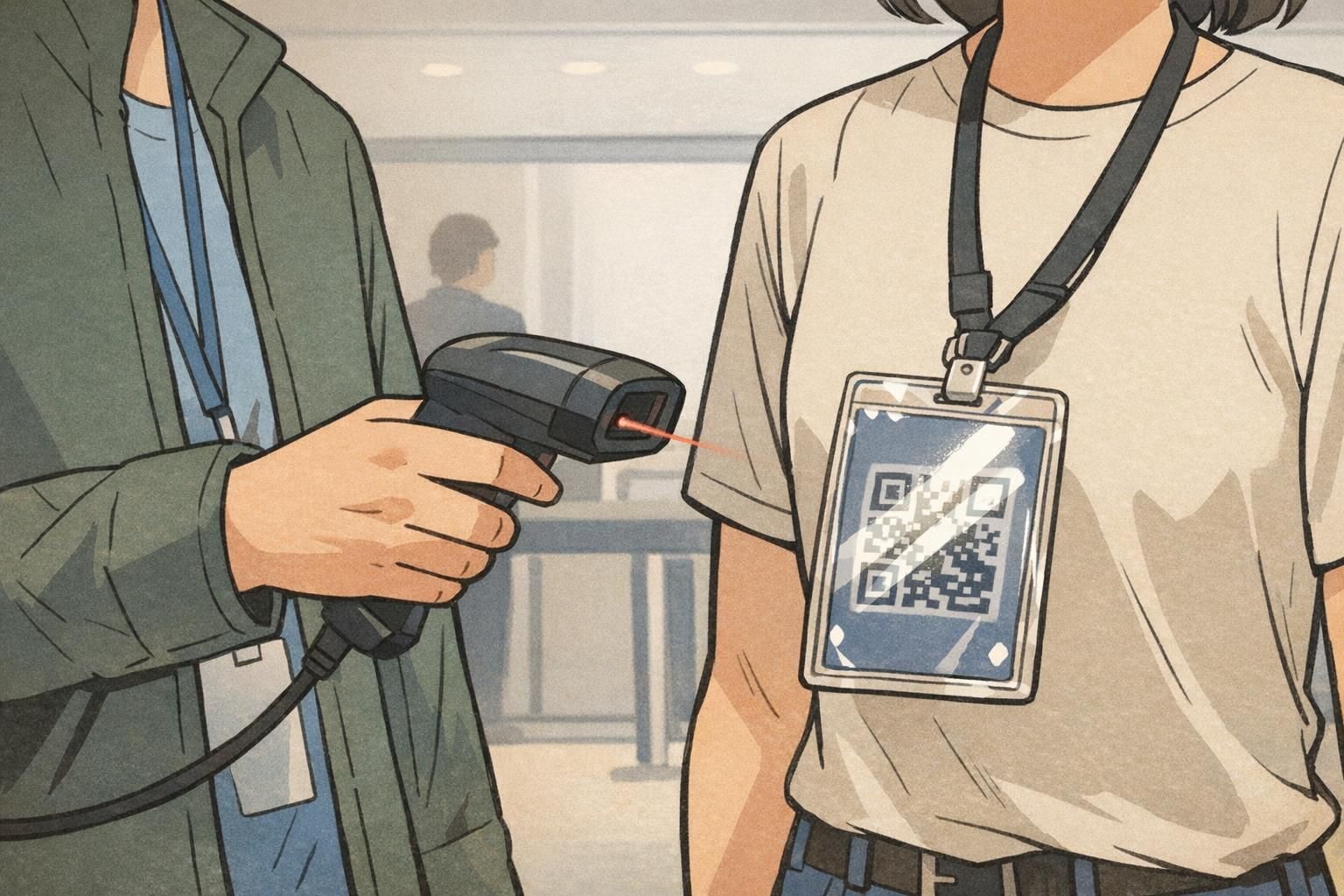
Placement Mistakes: Edges, Curves, Holes, and Lanyard Interference
Placement is the next major source of slow scans. A QR code can be perfectly generated and still fail if it’s placed where badges get bent, clipped, covered, or punched. Common trouble spots include corners, edges close to bleed, and areas near slot punches or holes.
Think about how people actually wear and handle identification. At check-in, many attendees naturally pinch the bottom half of a badge to hold it steady; at doors, staff might grab the top edge to lift it toward a scanner. If your QR code sits where fingers land, badge scanning becomes inconsistent—especially during busy moments when people don’t adjust their grip.
- Keep the QR code comfortably away from badge edges and corners to reduce the risk of cropping and wear damage.
- Avoid placing the code near slot punches, holes, clips, and retractable reels—these are high-risk areas for obstruction.
- Choose a location that stays visible when worn on a lanyard (consider the tilt and the way the holder frames the card).
- If badges will be held up for scanning, place the QR code where it’s less likely to be covered by a natural grip.
Design for how the badge will be worn and grabbed—not just how it looks on a flat template.
Contrast and Background Errors That Reduce Reliability
High contrast is the foundation of reliable scanning. Low-contrast QR codes—like light gray on white, or a colored code on a similar-colored background—often scan slowly or fail entirely. Phone cameras depend on clear edges and strong separation to lock focus and decode quickly.
Background design choices can also interfere. Gradients, patterns, textures, and busy graphics behind the QR code can break up the clean grid the scanner expects to see. Even when the QR code is technically “there,” the camera may struggle to distinguish modules from background detail.
- Use a dark QR code on a light, solid background for the most consistent results.
- Avoid placing the QR code on top of gradients, photos, or patterned areas.
- Do not add overlays, shadows, or decorative effects that alter module edges.
- Keep the quiet zone clean and unprinted—no borders, textures, or background art crossing into it.
“If the code looks stylish but the scanner hesitates, the design is doing too much. Make the QR area boring—and the line moves faster.” – Event Operations Lead
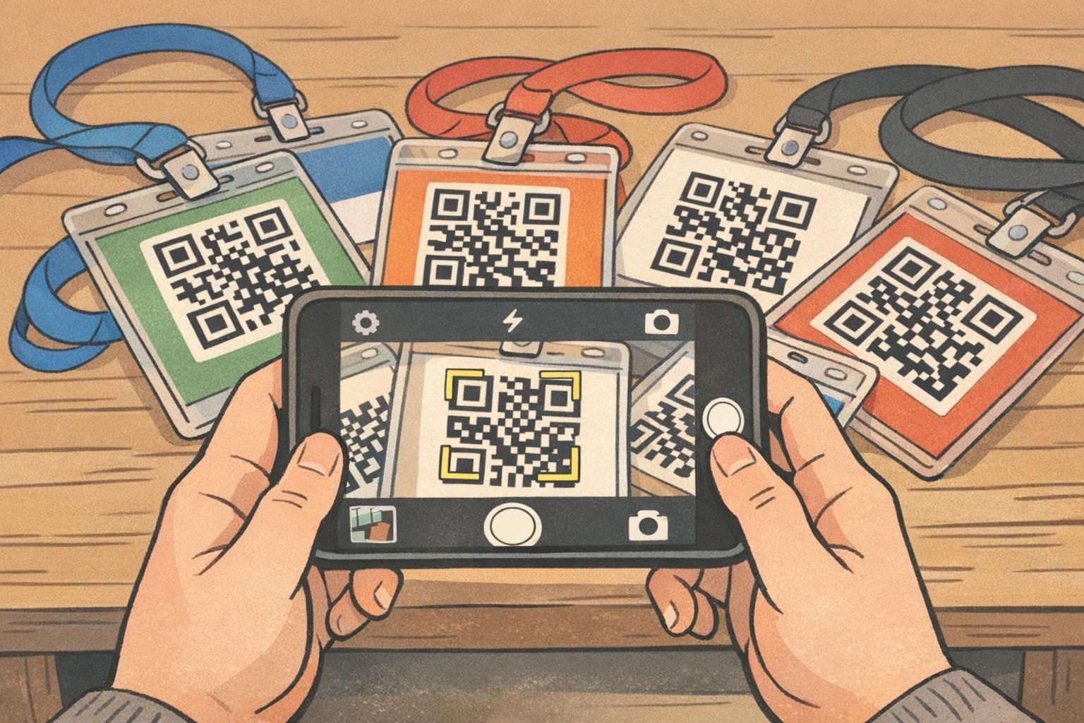
Multiple Codes Nearby: The “Wrong Code” and Mis-Scan Problem
Even when individual codes are well designed, proximity can create confusion. If multiple QR codes are close together—on the same badge face, on badges laid out next to each other on a table, or on signage near the scan point—some scanning apps can pick the “wrong” code. That can send someone to the wrong resource, check in the wrong person, or trigger the wrong workflow at exactly the moment you need speed and accuracy.
This isn’t just a theoretical edge case. When two targets compete in a camera frame, scanners can fail or select a different code than the user intended, especially when the camera is moving quickly during high-volume entry. For a neutral research-based discussion of QR recognition challenges in complex scenes, see source.
- Prefer one code per side of a badge when possible to reduce competing targets.
- If multiple codes are unavoidable, separate them with clear spacing and strong visual framing so the intended code is obvious.
- At check-in tables, avoid stacking badges so codes are visible in clusters within the same camera view.
- Keep nearby signage or posters with QR codes away from the scan lane, or position them so they’re not in the same sightline as badge scanning.
When mis-scans happen, users often blame the scanner. In practice, it’s usually the environment: too many codes in one frame.
Print Production Pitfalls: Cropping, Lamination Glare, and Color Shifts
A QR code that scans perfectly in a design file can still fail after production. The most common print issues are accidental cropping, glare from glossy surfaces, and last-minute resizing that distorts the code.
Cropping usually happens when a code is placed too close to the edge, or when the safe area wasn’t respected in the template. Even a slight trim shift can cut into the quiet zone or the code itself. Lamination and clear holders introduce a different problem: reflections. Bright overhead lights can produce hotspots that wash out parts of the code at the exact angle people naturally hold a badge.
- Confirm the QR code and its quiet zone sit safely inside the badge’s safe area (not near trim or punches).
- Avoid stretching or skewing a QR code inside a template; resize proportionally from the original.
- Test the actual finish you plan to use; glare behaves differently on glossy holders than on matte surfaces.
- Use consistent print settings and avoid unplanned color changes that reduce contrast in the QR area.
If you have control over material choices, finishes that reduce reflections can make scans more consistent in bright, uneven lighting. (BadgeZoo offers multiple finishes, including gloss and matte/silk, which can be helpful when you’re trying to balance durability and scan reliability.)
A Quick Pre-Print Badge Scanning Test Routine (5–10 Minutes)
Before printing hundreds (or thousands) of badges, a quick real-world test can catch the most expensive problems: codes that are too small, too dense, too close to an edge, too low-contrast, or vulnerable to glare. The key is to test the final layout on the actual material/holder setup you’ll use—under the kind of lighting you expect at check-in or entry.
- Step 1: Generate the final QR code (using the exact destination/ID format you will deploy).
- Step 2: Place it into the final badge layout at the intended printed size, with a clean quiet zone.
- Step 3: Print a small batch (even 3–10 copies) using the same printer settings and substrate/holder you’ll use for production.
- Step 4: Test on multiple phones (at least two different models).
- Step 5: Test distances that match real behavior: close-up at a desk and arm’s-length at an entry point.
- Step 6: Test angles: straight-on, slightly tilted, and while the badge is hanging on a lanyard.
- Step 7: Test minor wear: a light smudge or a small scratch on the holder, then scan again.
Simple pass/fail rule: if most scans take more than a moment or require repeated attempts under typical lighting and angles, revise before approving a full print run.
Yes. Different camera hardware and autofocus behavior can change scan speed. A code that’s barely acceptable on one phone may be frustrating on another—especially in bright or mixed lighting.
Always. Holders can introduce glare and slight distortions, and they change how people grip and angle the badge during scanning.
Choosing the Right Badge Format for Reliable QR Code Badge Use
Format decisions can make QR code badge performance noticeably better without changing your software system. If scanning is a core workflow—event entry, visitor management, staff access checks—small improvements in badge size, wear position, and finish can reduce scan time and user frustration.
In general, a slightly larger printable area gives you room for a bigger code and a safer quiet zone. A flatter wear position (for example, a stable holder on a lanyard) can also help, because the camera sees fewer curves and less motion. And if scanning will happen under bright lights, glare-resistant choices can help the code remain readable at common angles.
Event badges, staff ID cards, and name tags can all support QR-based workflows—what matters most is designing the QR area for quick, repeatable scanning. For example, a vertical event badge in a clear holder can work very well when the code is placed away from grips and hardware and printed with strong contrast. And you can also consider custom event badges sized for easy QR scanning if you’re standardizing formats across multiple events or locations.
- For fast entry lines: favor a layout with a large, high-contrast QR code placed where it stays visible while worn.
- For staff IDs used daily: prioritize durability and consistent placement away from clips, punches, and heavy wear zones.
- For visitor passes: keep the design simple and the QR area uncluttered to reduce scanning mistakes by first-time users.
- When glare is a known issue: consider a finish/holder combination that reduces reflections in overhead lighting.
Troubleshooting Checklist: Fixes for the Most Common QR Code Errors
When scans are slow or inconsistent, it’s tempting to blame the scanner app or assume users are holding the badge “wrong.” In practice, most QR code errors come down to a handful of fixable factors. Use the checklist below to isolate whether the issue is design, print production, or the scan environment—before you commit to a reprint.
- Make the QR code bigger (especially if people scan at arm’s length or while walking).
- Reduce encoded data (use short URLs or IDs instead of long strings) to lower code density.
- Restore and protect the quiet zone (no graphics, no borders, no background textures).
- Increase contrast (dark code on a light, solid background; avoid colored-on-colored combinations).
- Move the code away from clips, punches, corners, and natural grip zones.
- Check for cropping or distortion caused by last-minute template changes or resizing.
- Re-test on the real material/holder under real lighting—glare and reflections can change everything.
- Reduce competing targets: avoid multiple codes close together in scan areas.
Before you reprint: confirm the problem on a physical test badge, then adjust one variable at a time (size, data density, placement, contrast, finish) so you know what actually fixed it.
Once you find a layout that scans quickly and consistently, standardize it. A stable template—consistent QR placement, consistent quiet zone, consistent contrast treatment—helps future teams avoid repeating the same badge scanning problems at new events or new sites.