Color coded badge Backers and Color Bars for Quick Visual Role Coding
Why a color coded badge system works for fast recognition
A color coded badge system is one of the simplest ways to help people recognize roles quickly—without forcing anyone to lean in and read small print. In busy workplaces and high-traffic events, the first question is often not “What’s their name?” but “Are they staff, a visitor, or someone who can help me?” Color makes that first answer visible from several feet away.
This kind of role coding works especially well in hallways, reception areas, clinics, warehouses, school campuses, and large conferences—places where lighting varies, background noise is high, and people are moving. When staff can recognize categories at a glance, they can route questions faster, reduce check-in bottlenecks, and make everyday interactions smoother.
A strong color system doesn’t replace your ID card—it supports it. Color gets you to the right “bucket” fast, and the printed badge confirms the details.
- Faster wayfinding: visitors can identify who to ask for help without reading names
- Quicker triage at reception: staff can route questions based on role category immediately
- Reduced friction in loud or crowded areas: color is visible when text isn’t practical
- Clearer expectations: people can tell who may need an escort or special access checks
Badge backer vs. color bar: what each element communicates
There are two common accessory-based approaches to fast visual role coding: the badge backer and the color bar. Both aim to keep your main ID card consistent while making the “headline information” visible from a distance.
A badge backer is typically a colored panel placed behind the ID badge (often inside a holder, or as a backing layer). Because it occupies a larger area, it can be the quickest to spot in motion—helpful for high-traffic corridors or any environment where quick recognition matters.
A color bar is a colored stripe or segmented block—often placed at the bottom of the card design or as an added strip. It keeps the card’s overall look uniform while providing a simple visual code for department, access level, location, or attendee type.
- Badge backer: strong at-a-glance visibility; great for broad categories (Staff, Visitor, Contractor)
- Color bar: compact and consistent; useful for encoding teams, departments, or access tiers while maintaining one card layout
- Using both: backer for “who they are” (category), bar for “where they belong” (department/unit/zone)
A practical rule: use the largest, easiest-to-see color cue for the most important decision someone needs to make in the first second.

Department color coding ideas that don’t require changing the main card
Department color coding works best when it’s easy to understand and easy to maintain. One advantage of using accessories (like a badge backer or an added bar) is that you can keep a single ID card template for everyone while still creating clear separation between teams.
A consistent main card design helps your organization look unified and reduces admin effort. The accessory color carries the department signal, while the printed ID still shows the person’s name, photo, and any other needed details.
- Nursing: teal
- Pharmacy: purple
- Facilities: gray
- Environmental Services: green
- IT: blue
- Security: black
- Administration: navy
- Volunteers: yellow
If your brand palette is limited, you can still build a strong system by choosing a small set of high-contrast colors and reserving the most distinct colors for the roles that need immediate recognition. The goal is for staff to learn the mapping quickly and for visitors to understand it with minimal explanation.
Keep the mapping simple. When two colors look “almost the same” from 6–10 feet away, they’re not doing the job.
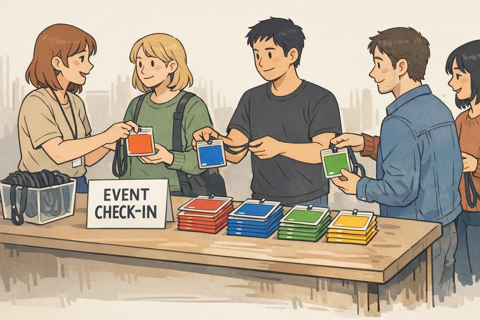
Visitor and event categories: quick wayfinding without confusion
Visitor settings and events are where color coding can pay off immediately—because most people don’t know the organization well enough to interpret job titles, departments, or building layouts. A clear color cue helps people decide who to approach for help and who should be directed to check-in or an escort process.
For event badges, accessory color also supports faster sorting at the table: staff can hand out the right badge holder/backer color by category without re-checking every line of text.
- Visitor
- Contractor
- Vendor
- Speaker
- Exhibitor
- Staff
- Student
- VIP
Assign distinct colors that remain recognizable from several feet away, then keep them stable year-round (or across recurring events). Consistency is what turns a color scheme into a system—people remember it after a few interactions.
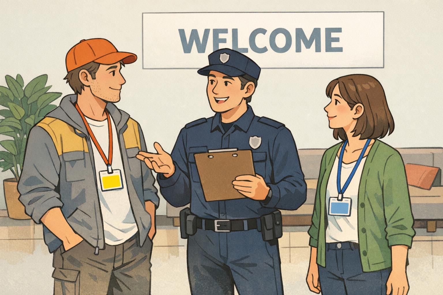
Security and operations: using color to support access checks
Color cues can support security and operations by providing a fast first-pass signal: who likely belongs in an area, who is assigned to a specific zone, and who may need to be escorted. This is particularly useful at entrances, in restricted corridors, and during shift changes when traffic increases.
The key is to treat color as an aid—not as the sole decision-maker. Staff should still verify the badge photo, name, and any printed access indicators as needed. In practice, color helps you decide when to look closer.
For workflows that need higher accuracy without slowing down, simple color patterns (like segmented bars) can work as compact “visual codes.” This mirrors how color-block style encodings can carry recognizable information in imaging contexts, helping humans (and sometimes systems) distinguish categories quickly even when fine text is hard to read (source).
- Use broad colors for access tiers (for example, public vs. staff-only vs. restricted)
- Use a second cue for high-risk areas (a striped bar or a second small color block)
- Train for “color first, confirm second”: glance at color, then verify photo/name when required
- Place a simple legend at security and reception so decisions stay consistent
Design and rollout tips: keep the system readable and consistent
A color system only works if it stays readable in real conditions and consistent across teams. Before rolling it out broadly, test colors under your actual indoor lighting and from typical viewing distances (for example, across a lobby or down a hallway). Colors that look distinct on a screen can blur together on a moving person.
Also consider accessibility. Because some people have color-vision differences, it’s wise to pair color with a second cue—such as a short role label, a simple stripe pattern, or a clearly printed category—while keeping the main ID card design unchanged.
- Limit categories: start with the roles that need the fastest recognition
- Prioritize contrast: avoid several similar blues/greens in the same environment
- Create a one-page legend: share it with managers, reception, and security
- Choose a second cue for accessibility: short labels or simple patterns work well
- Review periodically: departments change, and visitor types can expand over time
“We found that a simple legend at the front desk made the biggest difference—new staff learned the colors within a week, and visitors stopped guessing who to ask.” – Operations Coordinator
Where BadgeZoo products fit: practical ways to add color fast
If you want the benefits of quick visual coding without redesigning your entire ID layout, accessories are often the fastest path. Many organizations keep the same ID template for everyone and vary the accessory color by role, department, or visitor type so the category is visible immediately while the printed card remains standardized.
In practice, you might start with your highest-traffic roles (front desk, nursing units, event staff) and expand once the mapping is familiar. If you need help thinking through category sets or how to keep a system consistent across locations, you can share questions through http://badgezoo.com/contact.
For roles that benefit from a clearly labeled layer, BadgeZoo also offers role identifier badge buddy cards, which can be paired with standard ID badges to make category text easier to spot while still using your existing card design.
Common mistakes to avoid (and easy fixes)
Most color systems fail for predictable reasons: too many categories, colors that aren’t distinct in real life, or inconsistent use between departments and sites. The good news is that the fixes are usually straightforward—and you can often correct them without changing your core ID card design.
- Mistake: Choosing multiple similar hues (several blues/greens). Fix: reduce the palette and increase contrast; reserve “close” colors for categories that don’t require fast recognition.
- Mistake: Relying on color alone for critical decisions. Fix: train staff to confirm with photo/name and any printed indicators when access or safety is involved.
- Mistake: Different locations using different mappings for the same role. Fix: publish one shared legend and keep ordering centralized or clearly documented.
- Mistake: Making onboarding and replacements complicated. Fix: simplify ordering and stocking so new staff and visitors receive the correct color every time.
Use as few as you can while still meeting your operational needs. Many teams start with 4–8 high-contrast categories, then expand only if people can reliably distinguish them at a glance.
A badge backer is usually more visible from farther away because it covers more area. A color bar is more subtle and keeps one unified card design. Some organizations use a backer for broad category and a bar for department or zone.
It tends to reduce confusion when the categories are simple and consistent. A small legend at check-in and clear, distinct colors help visitors quickly identify who can assist them.
If people can’t identify the category from several feet away, the system isn’t doing its job. Optimize for real-world distance, lighting, and speed—then let the printed badge confirm details.