Badge readability fonts colors: How to Choose Easy-to-Read Typography and Contrast
Why badge readability fonts colors matter in real-world settings
Badge readability fonts colors aren’t just a design preference—they’re what make identification work smoothly in real environments. In workplaces, schools, healthcare settings, and events, people rely on badges to recognize names, roles, and sometimes access levels in seconds. When typography is unclear or contrast is weak, small errors add up: a name is misread, a role is misunderstood, or check-in slows down.
Badges also get read under imperfect conditions: glare from overhead lights, dim hallways, outdoor entrances, or the quick movement of someone walking by. Add common wear methods—lanyards that swing, clips that tilt, holders that reflect—and you can see why readability needs to be planned from the start.
A readable badge helps people do the “human” part of identification—recognizing and greeting someone—while supporting the “process” part—check-in, routing, or access workflows.
- Faster introductions: people can read names without asking repeatedly
- Clearer roles: staff, visitors, speakers, volunteers, and departments are easier to distinguish
- Fewer misreads: strong contrast and clean typography reduce mistakes
- Smoother flow: check-in lines and daily interactions move faster when badges are instantly legible
Readable badge design starts with choosing the right font family
If you want readable badge design, your font choice is the foundation. The safest default for most organizations is a simple sans-serif font family—think Arial, Helvetica, or Source Sans–style options—because these fonts stay clear at smaller sizes and during quick glances.
Decorative, script, condensed, or ultra-light fonts may look stylish on a website header, but they often break down when printed small or viewed from a few feet away. For badges, the goal is recognition, not decoration—especially for critical fields like a person’s name, role, unit, or department.
If your organization has a brand font, you can still keep things on-brand without sacrificing clarity. A practical approach is to use the brand font for a logo or a large header, and keep core identity text (the name and role) in a highly legible sans-serif.
- Use sans-serif fonts for names and roles to keep letterforms clean
- Avoid condensed fonts for long names—spacing gets tight fast
- Skip thin weights for printed badges; they can fade or break at edges
- If branding matters, separate “brand elements” from “must-read identity text”
Font weight, case, and spacing for faster scanning
Once the font family is chosen, readability depends heavily on weight, case, and spacing. For most badge fields, regular or medium weight prints clearly and stays easy to read. Bold is best used sparingly—when you need a quick visual signal like STAFF or VISITOR.
For names, mixed case is typically easier to scan than ALL CAPS because word shapes become more recognizable at a glance. ALL CAPS can still work in short labels (like role headers), but it often makes longer names feel dense, especially on smaller badges.
Spacing is the hidden readability tool. Comfortable line spacing and margins keep text from feeling cramped when printed and worn. And because badges are often read while moving, whitespace gives the eye a place to land—making identification feel effortless.
- Default weight: regular or medium for most text
- Use bold for short role labels, not entire paragraphs of badge text
- Prefer mixed case for names; reserve ALL CAPS for short category tags
- Avoid italics for key fields—slanted letterforms reduce quick recognition
- Increase margins and line spacing so text stays distinct when worn at an angle
“When names and roles are spaced well, people stop leaning in to read. That small change makes check-in feel calmer and more professional.” – Event Operations Coordinator
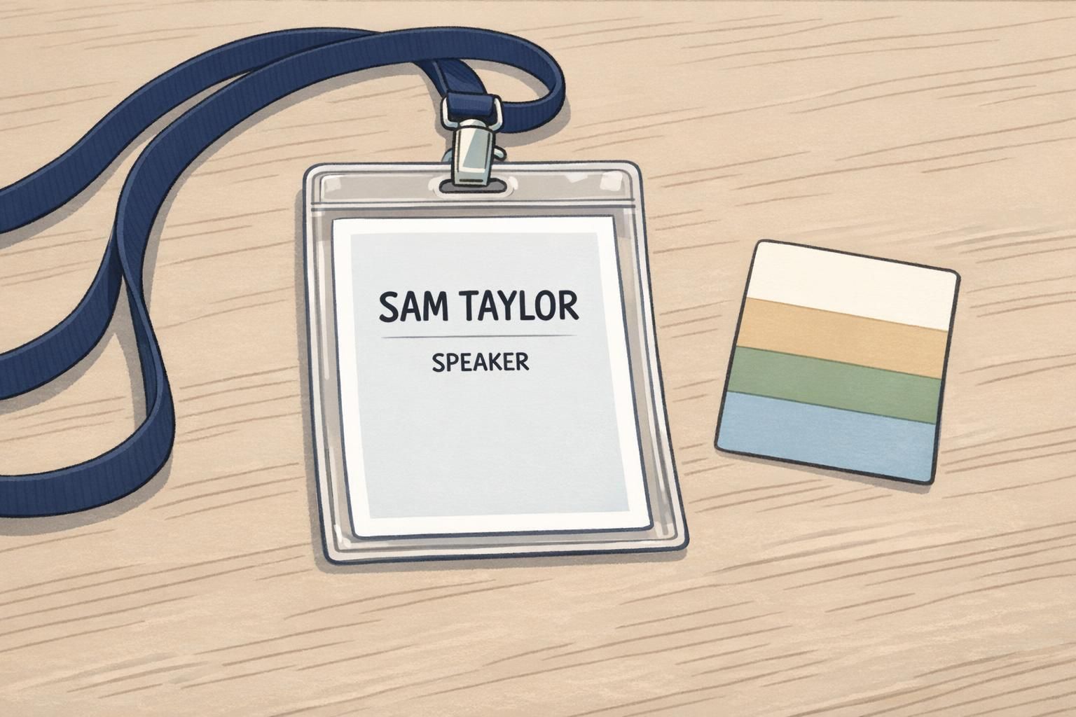
Practical font sizing by viewing distance (lanyards, clips, and event badges)
Sizing should start with a simple question: how far away does the badge need to be read? A badge worn on a lanyard at a conference is often read from several feet away during conversation. An ID card on a clip might be read closer—at arm’s length—during entry or verification. The farther the viewing distance, the larger your name line needs to be.
A practical pattern many teams use is to make the first name (or full name line) the largest element, then step down in size for secondary information. As a starting point, the name line is often roughly a 24–36 pt equivalent, a secondary line like organization or department sits around 14–18 pt, and small helper text stays around 10–12 pt when needed.
This is also where layout hierarchy matters: the eye should find the name first, then role, then any supporting details. Evidence-based guidance in information design and standardized structure supports the idea that clearer typography and consistent layout reduce comprehension errors and improve speed—principles that translate directly to readable badges (source).
Design for the “must-read moment.” If someone has one second to glance at the badge, they should reliably capture the name and role.
- Across a few feet (event networking): prioritize a very large name line and a clear role
- Arm’s length (workplace identification): keep name prominent, role readable, and avoid crowding
- If you must add details (company, department, pronouns, unit): keep them secondary and consistent
- Remove anything that competes visually with the name—especially repeated labels or extra icons

Badge color contrast that stays readable under different lighting
Badge color contrast is less about picking “different colors” and more about ensuring a strong light-versus-dark difference (luminance). Two different hues can still be hard to read if they’re similar in brightness. That’s why a dependable default for printed badges is dark text on a light background.
If you’re applying accessibility-minded standards, WCAG-style guidance is a helpful reference point: aim for about 4.5:1 contrast for normal text and 3:1 for large text. For critical identifiers—like a name line, a role used for routing, or a high-importance unit—higher contrast closer to 7:1 can be more robust, especially for low-vision readability.
Light text on a dark background can look sharp, but it requires extra care. Thin letter strokes can appear to “fill in” when printed, and glare on plastic holders can reduce perceived contrast. If you use reversed-out type (white on dark), increase font weight slightly and avoid overly saturated dark backgrounds that muddy edges.
- Best default: black or near-black text on white or very light gray
- If using a dark background: choose a heavier font weight and generous letter spacing
- Avoid mid-tone text on mid-tone backgrounds—even if the hues differ
- Check contrast in the lighting conditions where badges will be worn (lobby lighting, outdoor entry, hallways)
Using color to show roles without relying on color alone
Color is excellent for fast categorization—STAFF, SPEAKER, VISITOR, VENDOR—because people can learn a simple visual system quickly. The key is to pair color with clear labels and consistent placement so the badge still works for everyone, including people with color-vision differences.
Avoid relying on color as the only differentiator, especially with problem pairs like red–green or blue–purple. Two colors that seem distinct to one person may look similar to another, particularly under dim lighting or when seen briefly while walking.
A restrained palette keeps attention where it belongs: on the name. Often, one or two brand colors plus neutrals is enough. You can use a colored header bar, side stripe, or small badge buddy-style indicator area—then keep the main text panel clean and high-contrast.
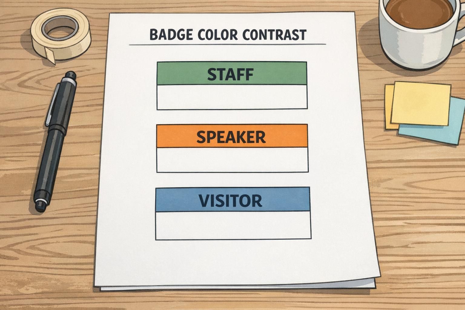
- Pair every color category with a text label (e.g., STAFF) in a consistent location
- Use color as an accent (header bar or stripe), not behind critical small text
- Keep the name area neutral and high-contrast
- Test role colors side-by-side to ensure they’re distinct in brightness, not just hue
Backgrounds, logos, and patterns: keep text areas clean
Busy backgrounds are one of the most common reasons badges become hard to read. Gradients, photos, and strong textures can look appealing in a template, but they reduce legibility behind names—especially when the badge is viewed at an angle or through a reflective holder.
A practical rule: keep the main name block on a solid color or a very subtle tint. Place logos away from the primary text area so they don’t compete with the name. If an image must appear, use a solid overlay panel behind the text to stabilize contrast across the whole name line.
This approach also supports consistency across different printing runs and wear methods. A clean text panel tends to remain readable whether the badge is on a lanyard, clipped to a pocket, or inside a holder with a bit of glare.
If you remember one layout rule: protect the name area. A clean, high-contrast text panel is more valuable than any background effect.

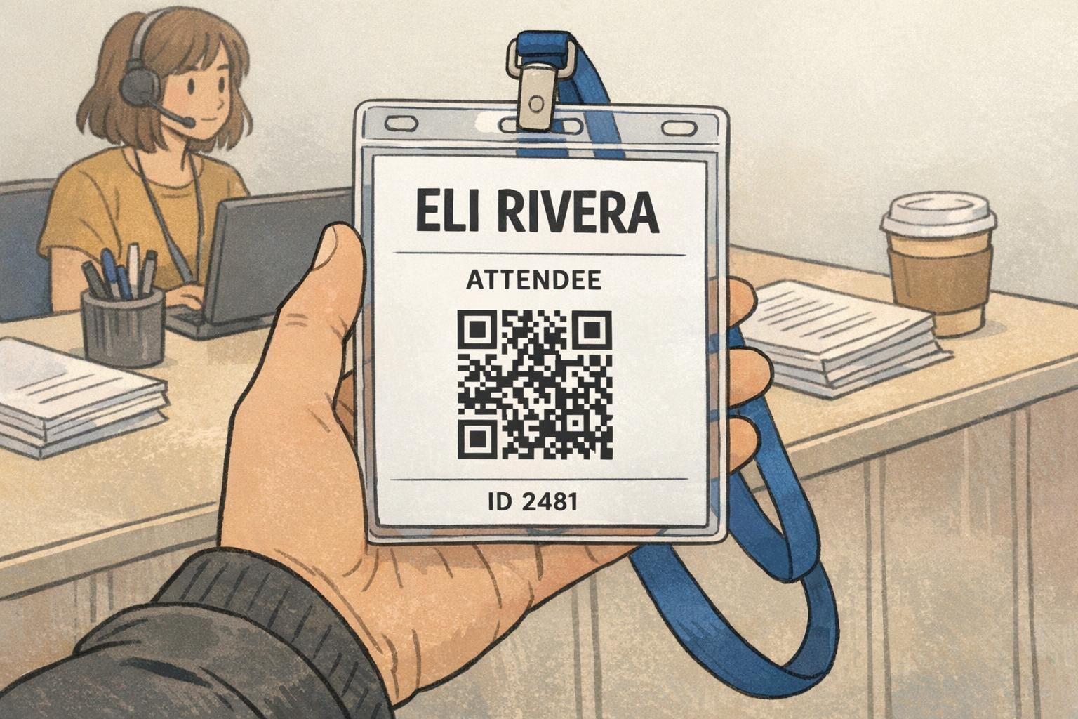
Adding QR codes and barcodes without sacrificing readability
Many organizations add QR codes or barcodes to support faster check-in, session tracking, or access workflows. The key is to treat the code as its own functional element—one that needs space and clean edges—without letting it crowd the name and role.
Reserve enough room for the code and keep a clear quiet zone around it so scanners can read it reliably. Avoid overlaying text, logos, or patterns on top of the code. If you need both scanning and human identification, pair the code with a short human-readable ID line (for example, “ID 2481”) that follows the same readable fonts and contrast rules.
- Give the code a dedicated area with whitespace around it (quiet zone)
- Keep the name and role visually dominant, even if the code is required
- Avoid placing the code behind glare-prone areas if the badge will sit in a reflective holder
- Add a short human-readable ID beneath the code for backup
Choosing materials and formats that support readable printing (BadgeZoo products)
Even the best typography can be undermined if the physical format doesn’t support it. Cardstock event badges, plastic ID cards, and name tags can render color and fine details differently, and certain combinations (like thin light text on a dark background) can be less forgiving when printed and worn.
A straightforward way to protect readable badge design across formats is to keep layouts high-contrast, avoid hairline font weights, and test-print a proof before committing to a large batch. Proofing helps you catch issues that only show up in real life—like slightly cramped spacing, a role color that reads darker than expected, or a logo that competes with the name.
When you’re planning an event or workplace identification system, it also helps to match the badge format to how it will be worn: lanyards for visibility, clips for convenience, holders for protection, or add-ons like badge buddies when role identification needs to stand out.
If you’re exploring event-focused options, custom event badges are a natural format to apply these font, sizing, and contrast best practices—especially when names must be readable from several feet away.
- Choose a layout that stays readable when worn on a lanyard or clip (tilted and moving)
- Use high-contrast text panels for names and roles across cardstock and plastic formats
- Avoid ultra-thin fonts and overly detailed background graphics
- Test-print and view at realistic distances before finalizing
The most reliable badge system is the one that works at a glance: clear name, clear role, consistent structure, and contrast that holds up under real lighting.